Sisters from Another Mister

In my last post I mentioned that I had been watching Terryl Whitlatch's tutorials on Creature Design where she explains the anatomy of various animals and why their anatomy is the way it is. She encouraged us to ask ourselves the why of the creature before beginning a design. 

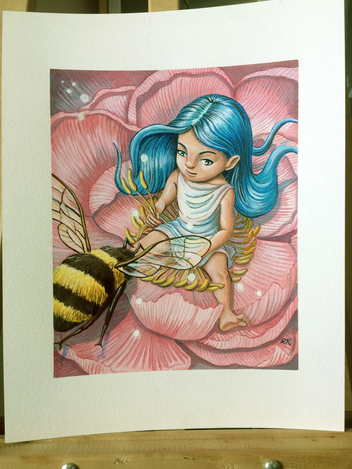
One of the assignments was to create a fish hybrid using either an amphibian or reptile, and, in my search for reference for the assignment, I had stumbled upon a ballerina fish that became an inspiration for me. While I was exploring ideas for the first piece from my previous post, another idea popped into my head of a girl with hair made to look like those big flowing fins and so I scribbled it out as best I could. I wasn't sure at first where it would go but the backstory in my mind started to develop. The why of the hair would be camouflage to help her hide amongst coral and seaweed near her home. She became my version of a mermaid. She is pleasantly surprised to find a couple of friendly creatures with some similarities to her, hence the title. As you can probably guess, I'm not very good at coming up with titles.  ;) But I keep trying!

This is now available as a print and other items at my Society6 and Zazzle stores.

On a related note, I should point out who Terryl Whitlatch is. I also mentioned her in my previous post and it had completely slipped my mind that some readers might not know who she is. She is an amazing artist with a background in zoology. She might be best known for her work with LucasFilm, designing many aliens and species for Star Wars Episode 1 and some of the creature re-designs in the re-mastered trilogy. Here are some additional sites featuring her work. Go check them out!

Ballerina goldfish watercolour painting

I've been watching Terryl Whitlatch's videos on Creature Design, and week 2 was all about creating a fish-hybrid using either an amphibian or reptile as the other portion. In my search for reference of koi fish for the one part, I stumbled upon images of the pinkish-white ballerina goldfish. The fish's large but delicate fins make them visually appealing, somewhat like flower petals. So, my initial drawings of koi fish morphed into a ballerina-koi hybrid fish and the homework was temporarily abandoned so that I could pursue this image further.

I decided to paint it in watercolour using one of my favourite colour combinations of turquoise and orange. I set about creating rough sketches on paper, then brought it into Photoshop to play with the design before committing paint to paper. I used Dr. Ph. Martin's lightfast indian ink and white acrylic paint.

The original will be available for sale on my Etsy store. Regular prints and other items featuring this image are available at my Society6 and Zazzle stores. 


Thumbelina

In my continuing quest to get back to traditional media, I decided to do this piece in watercolours with a touch of acrylics and Prismacolour pencil crayons to refine some areas. The idea was born while brainstorming a comic book cover but something about the girl stuck with me and so I put it away until I had more time to work on it. I ended up scanning it and bringing it into Photoshop to play with various concepts before printing it out and transferring it to watercolour paper. Instead of Fabriano paper, I used Arches 140-lb cold-pressed paper which has a slightly different texture than the Fabriano but still lovely to work on. I finished up with a couple of coats of Krylon archival matte fixative. 

I am continuing to try and apply what I've learned from Nathan Fowkes class on Composition to each piece. For now, I will be going into less detail about my classwork to focus more on producing art and blogging about it. I hope you keep reading because I still plan to keep sharing!

The original piece is now available on my Etsy Store and prints are available at my Society6 store.

Watercolour Painting of Peonies and Dragonflies

Some months back I purchased a set of Dr. Ph. Martin's India Ink because I heard they were nice to work with. This past weekend I felt the urge to try them out.

For my first painting I didn't want to try anything too complicated. I just wanted to get used to working with the medium. I picked a spring theme because I'm tired of the cold weather that feels like it will never leave!  I chose peonies as my main subject because they remind me fondly of yearly trips my family and I used to make visiting my grandmother in New Brunswick. She had the most beautiful peony bushes growing in front of her house so when I see peonies they remind me of her and those carefree days. I also chose pretty dragonflies that remind me of spring. I painted my favourite colour combination of oranges, greens and blues. My second week's assignment for Nathan Fowkes's class on composition was to use unity with variety to create a meaningful relationships with the subject and I kept that in mind when creating this piece.

I used a couple of fine nibs, and a size 10, white Taklon brush on 140-lb cold-pressed paper (un-stretched). I found them all delightful to work with. I taped down my page and didn't use a lot water so the paper stayed fairly flat. I finished with three light applications of Krylon matte archival fixative spray.

The original will soon be available to purchase but I've put up prints and products featuring this art on my Society6 shop. For a limited time, there is a free shipping promotion going on. Promotion expires May 8, 2016 at Midnight Pacific Time.  

Promo code: https://society6.com/rinarozsas?promo=8QPG4QQM2C8G

Update: The original is now available on my Etsy Shop.