The Clues and Mews Detective Agency

Here’s the breakdown for a piece I created along with a little story prompt.

Simon runs to his family's store after school. There, he solves cases with his trusty assistant, Mittens, who paws and scratches at everything to unearth clues. Office space for gumshoes isn't easy to come by these days!

Close-up

Some colour studies.

Trying out values.

Figuring out values

Thanks for looking!

Tee Designs

Around the end of May 2020, while I was in the midst of designing icons, Almex came to me with their idea to create a series of collectible T-shirts. They wanted something fun with a vintage feel to help promote their products; something that would harken back to the early nineteen century with a bit of a cartoony pinup style.

By a bit of a strange coincidence, I was, at the time, helping another artist colour their graphic novel based on Buster Keaton, a historical figure of the same era. I love historic imagery so this was right my alley.

One of the things I like about being an illustrator is the whole exploration process: looking up reference—poring over clothing styles, typefaces, etc., whatever needed to fit the image best—and learning enough about what I’m about to draw (the equipment). Hopefully, I was able to make the things happening in my illustration be somewhat believable for the intended audience.

Below is some of the process I went through for a couple of the tees.

Some character iterations.

These were rejected but I had so much fun coming up with these that I wanted to share.

Working through colour options.

Some earlier rejected concepts based on their suggestion of super-heroine figure possibly stopping the rip in the belt.

During the reference collection stage, one of the artists I felt most inspired by was Duane Bryers. His poses and expressions were so comical and well-executed that I felt an instant connection.

Some Recent Commercial Work

Thanks to a referral I recently got to work on an fun project producing vector art for a short animation. It was an educational video for a pharmaceutical company on the subject of leadership. One would think it would be a little dry but it actually turned out to be quite entertaining! It was a collaborative process involving a small creative team of people.

Due to confidentiality I won’t be able to share all of the assets (there was quite a number) nor the final video but I can share several final images, the iterative process, and even some of the rejected ideas. A few ideas were shelved, either because they were a little too playful, or didn’t serve the final message as well as others. Not all ideas end up getting used but it’s all part of the process on getting to that final stage.

Some Scenes Used in the Final Video:

Roughs of Some Approved Scenes:

Images and Ideas That Didn’t Make the Cut:


Reviewing RedBubble with New Artwork

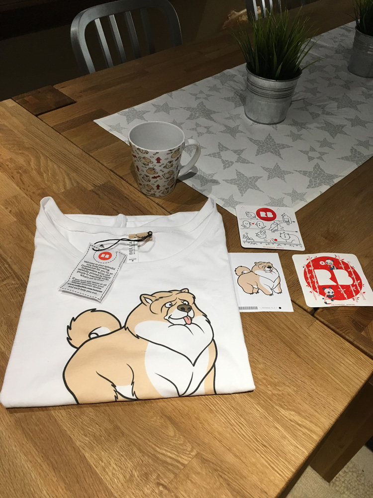
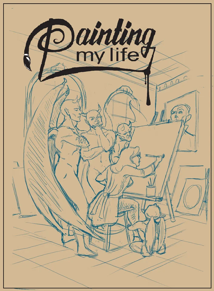
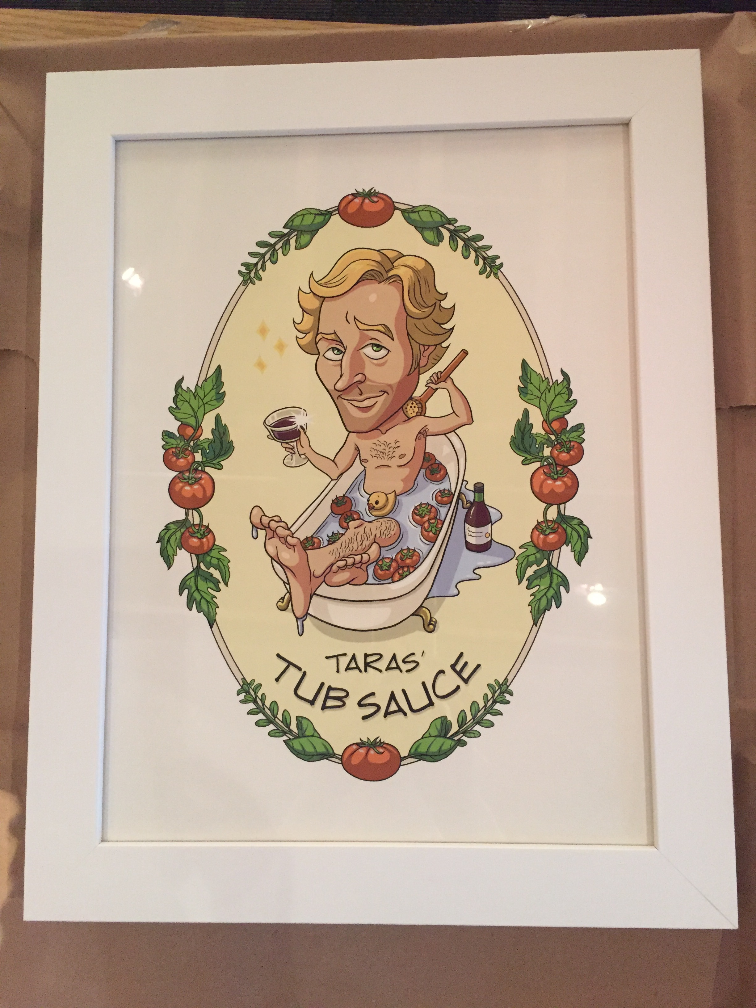
As an independent artist there are many venues that do print-on-demand so it's hard to vet them all. However, having heard good things about RedBubble from fellow artist friends, I decided to try them out. I'm happy to share that I've added them to the list of stores that sell my artwork. Recently, I added some new artwork featuring a re-designed version of a Chow Chow character. I created it a while back for a friend's comic pitch that unfortunately didn't make the cut for an anthology. I felt it was a shame to shelve the character so I decided to take another crack at "Gordon" to see if I could push his design further and make him more adorable. I'm all about the cute these days and feel like it's a direction I want to keep going in, at least for now.

I ordered some things from both my RedBubble and Society6 stores using the same design in order to compare the quality, colour accuracy and speed of delivery.

My First Impression of RedBubble:

RedBubble performed better than my other store, Society6, when it came to delivery time but for Canadians I think there may be a bias. RedBubble has a location in Burlington, Ontario and I'm in nearby Toronto. Society6 ships from the US so there will always be a delay at the border. I think customers in the US would get comparable delivery speeds because RedBubble also has a American location.

I was already impressed with getting my packages quickly—within 5 days—along with a follow-up email to confirm delivery but it didn't end there. All of items from RedBubble arrived together. The packaging was also really well-designed and my mug was even safely nestled in a sleeve within the outer package. I don't know how many times I've received things from other vendors where items arrived bent or broken so this was nice to see. You can tell they put a lot of thought and care into it. Their attention to details—a tiny wooden clothes peg holding the tee-shirt tag, overall product quality, colour consistency amongst the products, and printing accuracy—helped make a really good first impression. I'm quite happy I tried them out.

Society6

My Society6 items arrived separately (because they use different fulfillment vendors) and took much longer, likely due to clearing customs. While Society6 provides tracking while in transit in the US, they don't extend that after it reaches Canada so that's something I'd like to see improved. Most items took about 2 weeks to arrive but the notebook ended up taking over 3 weeks! I had just sent in a request for a replacement, fearing it had been lost, when it finally arrived. Doh! One thing I will say is that their return/refund system is quite smooth and painless. Their customer service response is pretty good; I waited less than 24 hours.

Because Society6 uses different vendors I believe that's why the colour wasn't consistent from product to product. For instance, although the travel mug (on the left, in the second image below) looked good it was a lot more yellow than I would have liked. The hubby and I were split on which stickers we preferred, the glossy Society6 stickers or the RedBubble matte treatment. Both were of very good quality. Time will tell as to which one is more durable. The notebook turned out nicely. The paper has a nice smooth texture similar to 28-lb bond paper. I can foresee filling it up with lots and lots of drawings!

The Re-design

And lastly, some of the sketches leading up to the revised design of Gordon.

Painting My Life Preview Issue Comic Cover

I was flattered to be asked to draw and ink an alternate comic cover for Canadian writer and filmmaker, Pasquale Marco Veltri. He wanted the cover for the preview issue of his graphic novel, Painting My Lifepencilled and inked by Ian Wright and coloured by Jorge Cortes

The creative brief I received was to have the main character, Alice, seated in the centre of a room, painting herself and everything in the room on canvas while gargoyles watch attentively nearby. He wanted the painted scene to be repeated in the painting within the painting. To increase the level of unease, he wanted the painting of the old woman on the wall to be repeated on most of the canvases, watching Alice work with varying levels of disapproval or dismay. This was a challenging image to work on because of all the elements and expressions. Because I'm a huge fan of animation and anime I took inspiration from some of my favourite shows and movies when designing the characters while trying to maintain the main characteristics of the characters I drew.  A mirror was always at hand while I acted out some of these poses and expressions!

While drawing this out in Clip Studio, I ended up adding in some flats for my own purposes to help me separate the foreground from the background. I'm not a typical penciller laying out shading and heavy inks because I often colour the page myself and so I was a little worried whether my pencils had enough information for the colourist but my fears were unfounded as he did a fantastic job! When I saw the finished version, I was surprised that his colour scheme was actually similar to my working flats. When I did my flats, I thought it would be nice to colour it later but then another project came up and it didn't look like I would have the opportunity anytime soon. 

Tub Sauce

I was recently commissioned to create a label to go on a mason jar as a birthday gift. The client wanted an illustration of his friend, Taras, who enjoys making his own tomato sauce with ingredients from his backyard. I was told that he washes the tomatoes in his clawfoot tub so the client came up with this fun idea of having him in the tub with his tomatoes sipping a glass of wine while he scrubs his back. I thought the idea was cute and really enjoyed working with the art director, Samantha, who was the go-between for this little project.

It started with me trying to get his likeness down from the photos I was sent. I was given a concept sketch to use for inspiration and asked to see if I could come up with other ideas. Because of the tomatoes and herbs, I thought it might be nice to add them as a decoration around the image and we did end up using that. The toothbrush was another fun thought that popped into my head but in the end we ended up using a bit of the initial concept with the herb and tomato border. My hubby came up with a couple of great text ideas but in the end they wanted to go with text that more closely matches his hand writing. The text, cutout and framing was all done by Samantha who did such a wonderful job. I'm told the recipient was quite surprised and pleased with his gift!

Happy The Force Awakens Day!

I was overcome with inspiration to create something Star Wars related after listening to the soundtrack for the Force Awakens last night. I hope you enjoy! :)