The Clues and Mews Detective Agency

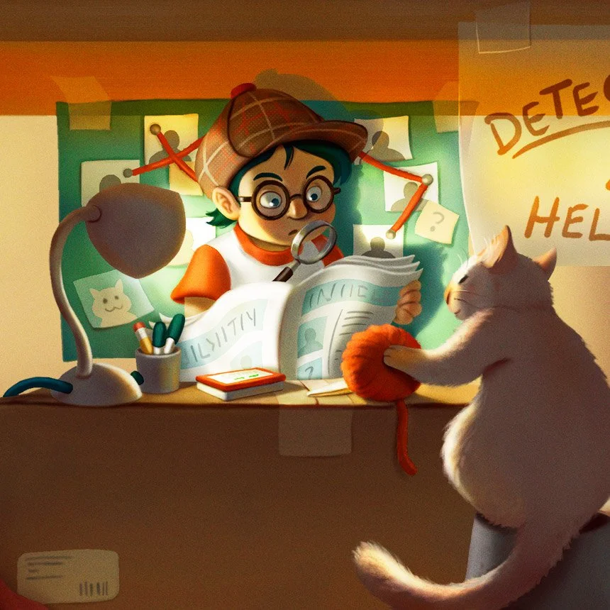
Here’s the breakdown for a piece I created along with a little story prompt.

Simon runs to his family's store after school. There, he solves cases with his trusty assistant, Mittens, who paws and scratches at everything to unearth clues. Office space for gumshoes isn't easy to come by these days!

Close-up

Some colour studies.

Trying out values.

Figuring out values

Thanks for looking!

Artwork for an Art Exhibit

I’m finally able to share some artwork I was commissioned to create for an investment firm last year. The exhibit was to feature their employees’ kids’ artwork alongside a professional artist’s interpretation. I was told the event was inspired by the Monster Project, a project I participated in back in 2019. I really enjoyed working on these and I hope these kids keep creating as they have such a great imagination!

The exhibit was delayed until recently which is why I’m just sharing it now. Unfortunately, some of the work I do never sees the light of day (NDAs, projects getting cancelled, postponement, etc.) so it’s great when I do get to share.

What I recently learned from a workshop seems to have crept into my workflow: like those fun textures on the colourful dandelions!

Digital Painting with Bobby Chiu

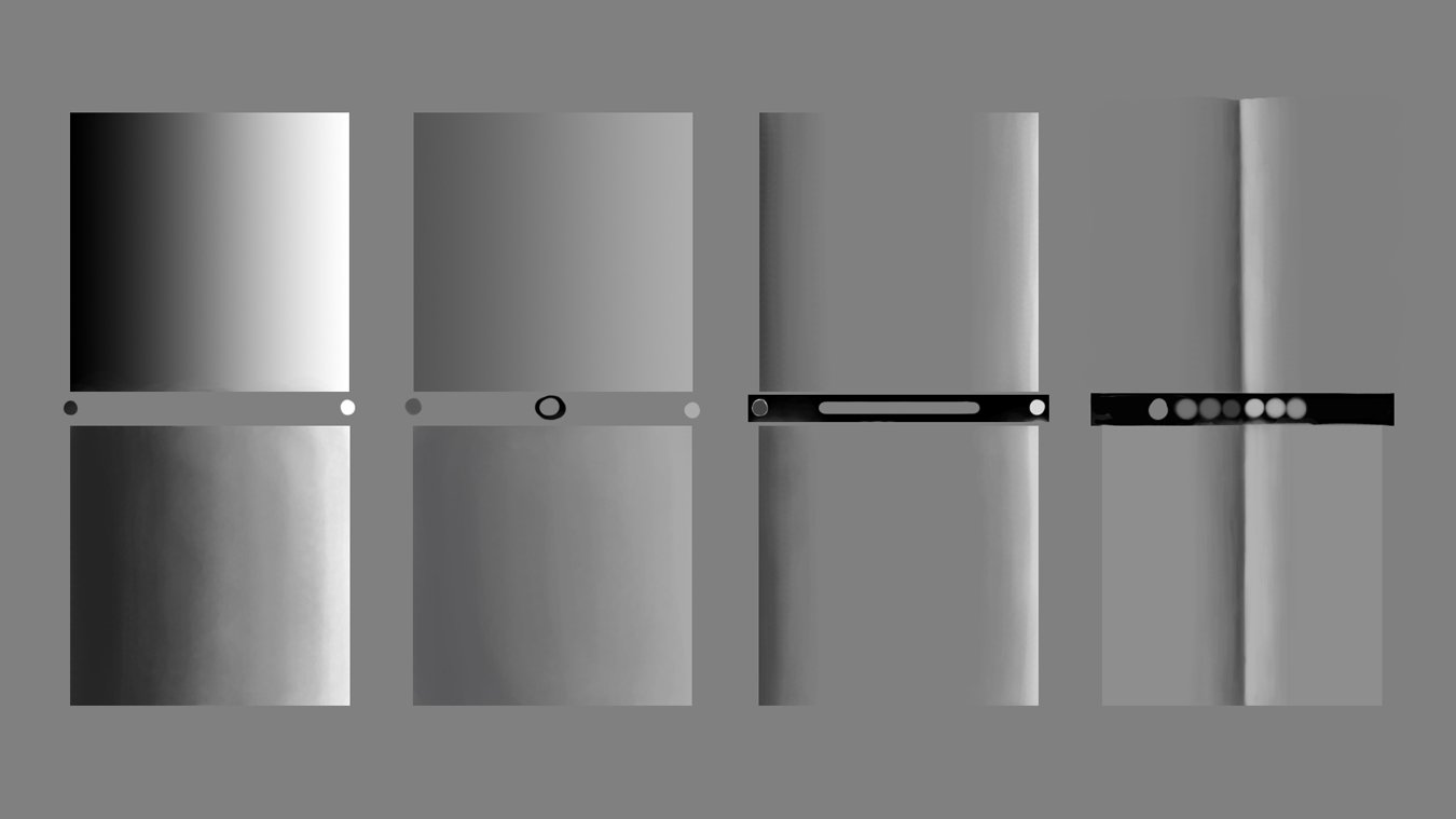
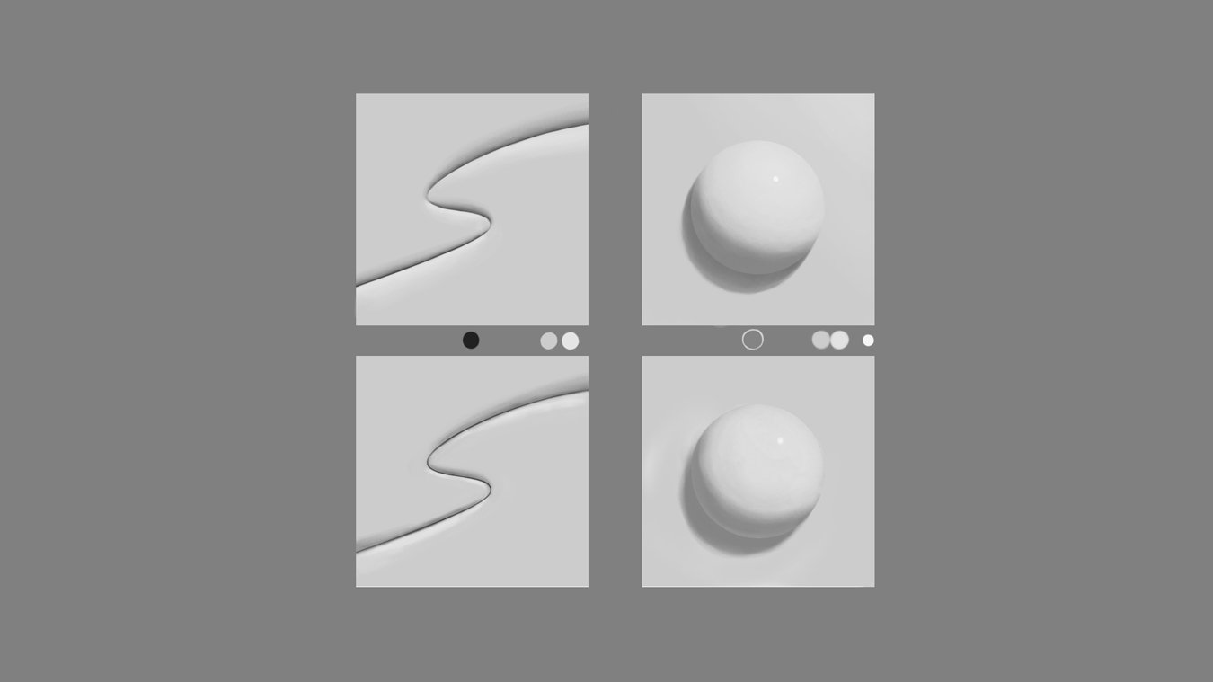
I recently completed another course through Schoolism: Digital Painting with Bobby Chiu. I’ve had access to these courses for a while but between personal and client work, the challenge has always been motivating myself to actually go through them. In the past—when I did have time—I’d just skim the videos to try to apply it to my own work. However, I am encouraging myself to put in the extra effort to do the assignments and pay more attention to the lessons.

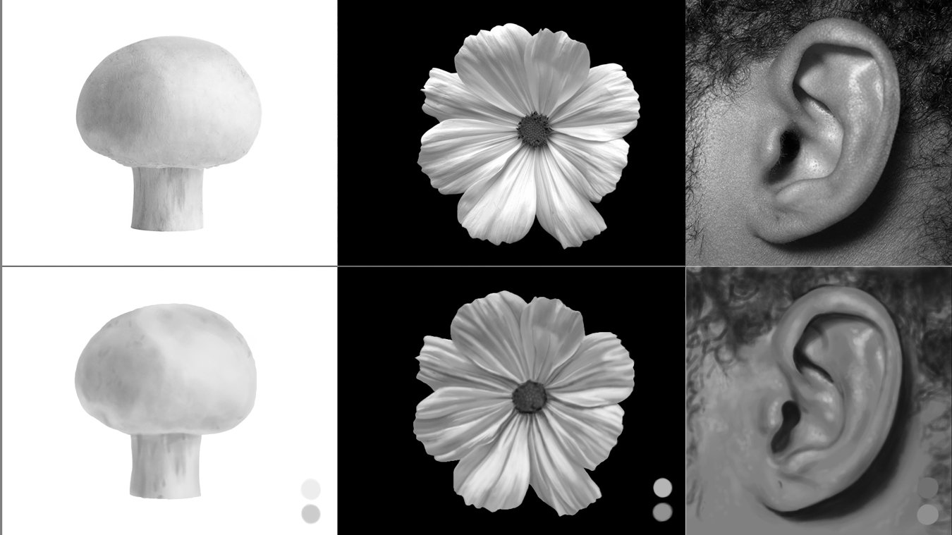
The lessons start off with foundational greyscale studies of objects and people, most of them timed. In one lesson, I drew the same girl 8 times in different orientations using the provided photo reference, then ultimately from memory. She definitely was burned into my brain by the end of it. Repetition is a great way to get to know your subject. In another of the timed lessons, a photo of Kim Jung Gi’s was referenced. The one on the left is Bobby’s where he prepared the under-drawing, curves and adjustment layers for us to paint in the highlight and darks; the one on the right is mine, drawn from scratch in about an hour.

Subsequent lessons focused on adding colour on top of the greyscale images Bobby created (you’ll probably recognize his iconic style in the fungi man and lizard creature). These were lots of fun to practice on.

I completed all of the lessons and, like in some of my posts, I will show only some of the results so I don’t give it all away.

Lessons 1 and 2: greyscale studies using a hard round brush with low flow and opacity

Lesson 3: Timed photo studies of Kim Jung Gi (the image on the right is mine done from scratch) I’m a lefty so placing the photo on the right was much easier for me.

Lesson 4: Applying colour to Bobby’s greyscale characters

Lesson 6: 20-minute greyscale studies from provided photos.

Inspired by the lessons I decided to take one of my character sketches and apply what I’d learned in this class. I may make a collection of these plant creatures.

Icon Designs

Back in May of 2020, a friend of mine who worked for a conveyor belt company asked if I’d be interested in designing custom icons for their tablet, the ALMEXPAD Senior 3.0.

I was a little nervous — I’d never done anything quite like that before but was up for the challenge. I had been slowly been building my skills so I told myself, “Yeah, I got this!”

My first attempts turned out a wee bit too cute for the intended target audience (see the images below) and likely better-suited to a children’s book but some of the rejected sketches did evolve into some of the icons that were approved.

Designing icons for this project was a great experience and I learned a lot from it.

I designed 35 icons in total. Below is a small selection and some of my process.

Initial ideas.

Chorizo the Game Background Art

Recently, I was asked to create some background art for an indie video game by an artist that I follow on Instagram. His project is still in production but he has kindly given me the go-ahead to share my contribution.

It was a happy coincidence that this opportunity came about; lately, I had been trying to incorporate more backgrounds into my personal work and posting them along with background studies to Instagram. He came across my “Goldhorn” painting and it aligned with the style he was going for. Because my background studies were more for learning, I wasn’t sure how they would work in terms of animation. Fortunately, this parallax animation didn’t require that I deviate too much from my normal workflow—keeping the foreground, mid-ground and backgrounds as separate layers. Of course there were some things I had to be more concerned with, such as painting-in hidden elements so the environment would appear more seamless when layers moved. It was a fun experience and I would welcome the chance to do work like this again.

The Backgrounds

I was sent the following sketches to use as guides. The last image—with the client's cute pig character for placement—is an earlier version I did of the hut scene. For the sunset scene, I was asked to change the monkeys to the “see/speak/hear no evil” iconic poses.

When there is more information available about the game it will be posted over at the official site.