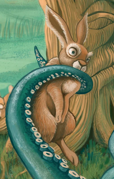
Wraparound Cover for Seven Strange Stories
I was excited to be asked to create a one-page cover for Oliver Ho's upcoming comic anthology entitled, Seven Strange Stories, even though I had already illustrated a couple of the stories within. As we went back and forth with the designs, it evolved into a wraparound cover to allow for more elements from each story to be weaved in without feeling too congested. With most of the stories containing some supernatural theme my goal was to create an image that looked like a dark fairy tale but without being too extreme—just enough to suggest it. Because I am a huge fan of James Jean and his work often contains disparate components, I looked to his art for inspiration.
My Process on Getting Started
Despite looking at various Fables covers, I still didn't have a clear idea in mind. So, I jotted down some elements from each story that I wanted to draw and then started to sketch them out roughly onto a huge pad of newsprint. I tried not to worry about creating anything concrete but focus on loosening up and get a feel for what might be included on the cover. Sometimes just doodling whatever comes to mind or doing practice drawings will do the trick to keep from overthinking things. Oftentimes, I go into a bit of a trance and drawings begin to overlap because I don't want to turn the page. I'll often look back at my scribbles and an idea will come to me—not always for what I'm currently working on, mind you—but I can always use them for other projects. I liken it to staring at clouds or patterns where images would begin to form.
I sketched out some thumbnails from the ideas and sent the ones I liked best to Oliver. When he approved one I took it into Photoshop to further develop; I created a clean image using a pencil brush on a greyish-toned background that I would later paint over.
Colour Selection
Ah, colour selection. This one's always tough for me because, well, the paradox of choice, of course. :)
I decided that I want a limited palette because it's more efficient and creates a better balance. I went to paletton.com and selected a tetrad colour scheme of blues, greens and their complimentary oranges. I chose this combination to emphasize a slightly sinister theme with warmer tones to balance things out and suggest that things are not all doom and gloom. I also use white but not pure black and combine colours from my palette to create variations. When I was almost finished painting I tweaked some of the colours using a Levels Adjustment Layer.
Design Challenges
I had never created a wraparound cover before and there were a couple of things to consider including:
- Not having any important elements overlapping the spine. The spine width depends on the paper stock, the number of pages and binding style, so I worked this all out before painting.
I also had to consider the placement of the title, trade dress and promotional text while keeping an overall strong composition. I planned out roughly where all these items would go and made sure that they wouldn't obscure anything important in the art.
The book is still in production but it shouldn't be too much longer. When I have more information on its release, I will share details.
Update
The book is now available and can be purchased directly from Oliver Ho at www.sevenstrangestories.com. You can also find the book at the Page & Panel: The TCAF Shop, Silver Snail, and Another Story Book Shop.


