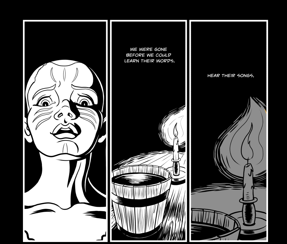
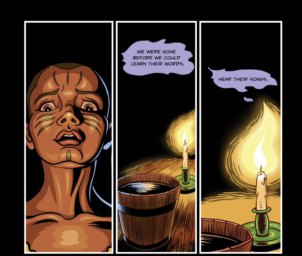
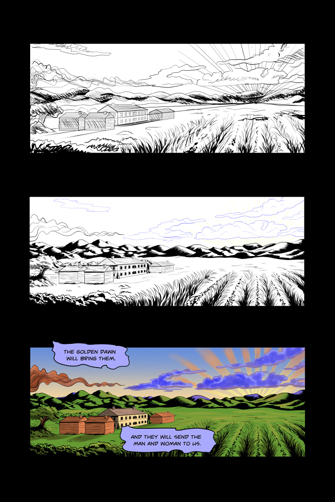
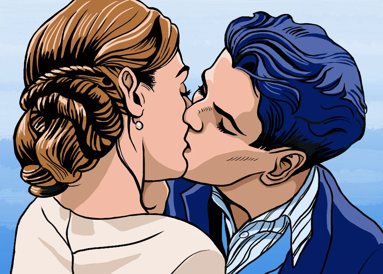
Greys for a Graphic Novel

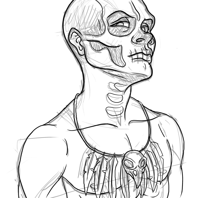
Back in March of 2021, a friend of mine, Sam Noir, asked if I’d be available to help out a mutual friend, Matthew Tavares, on a graphic novel. Sam was lettering it and Matt had his hands full with the pencilling and inking. A lot of the colouring was still outstanding so I offered to help out where I could between my own client work.

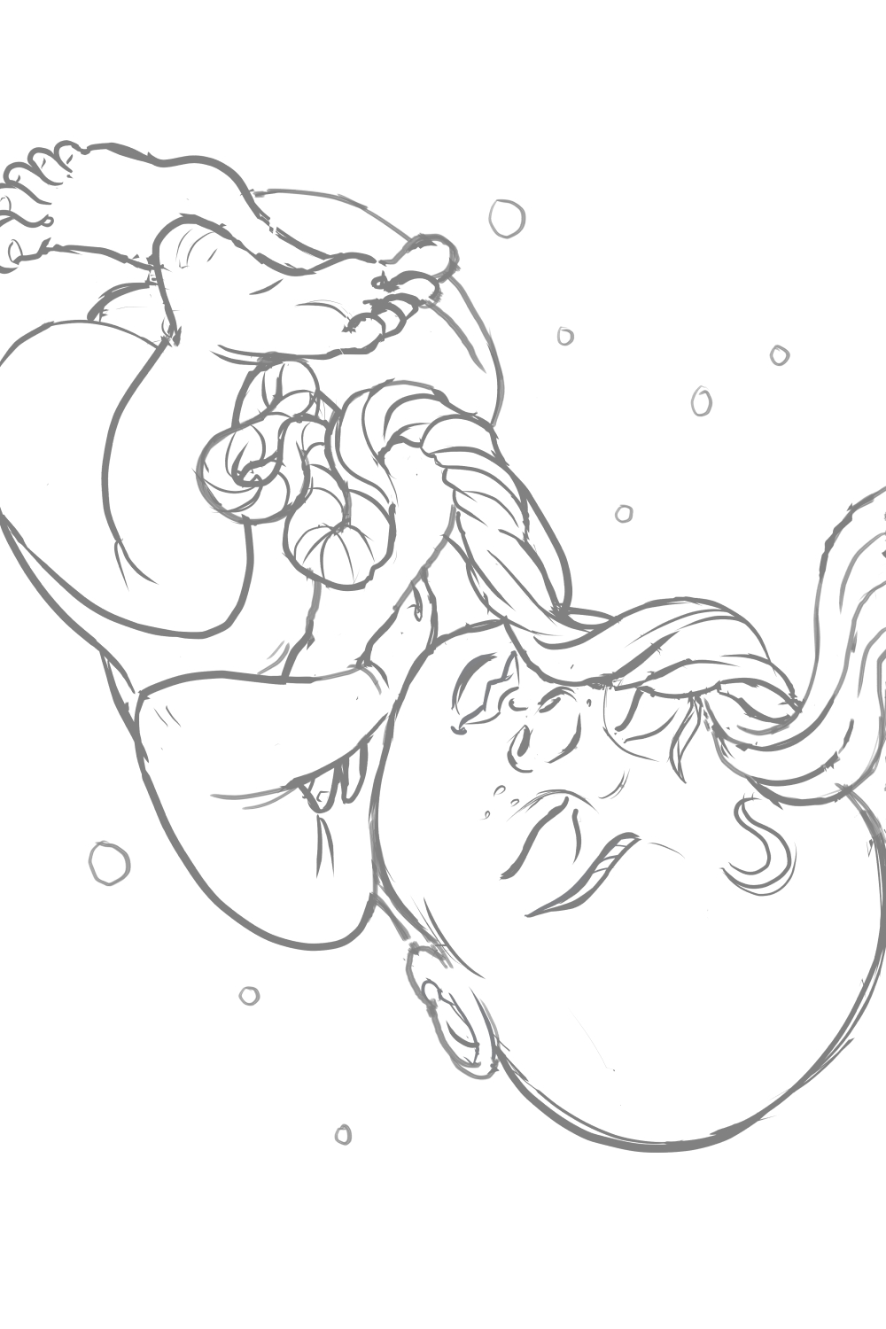
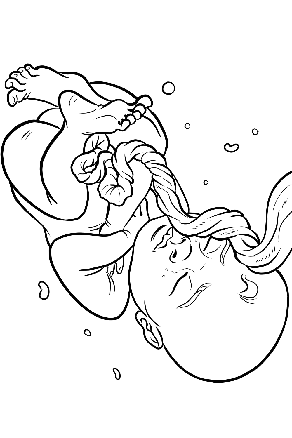
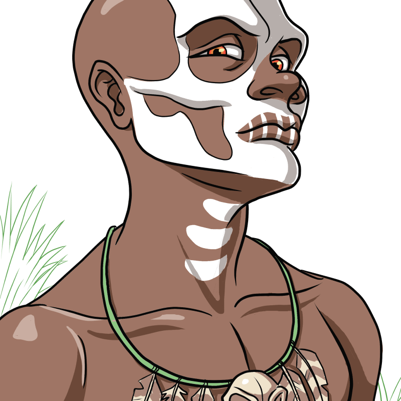
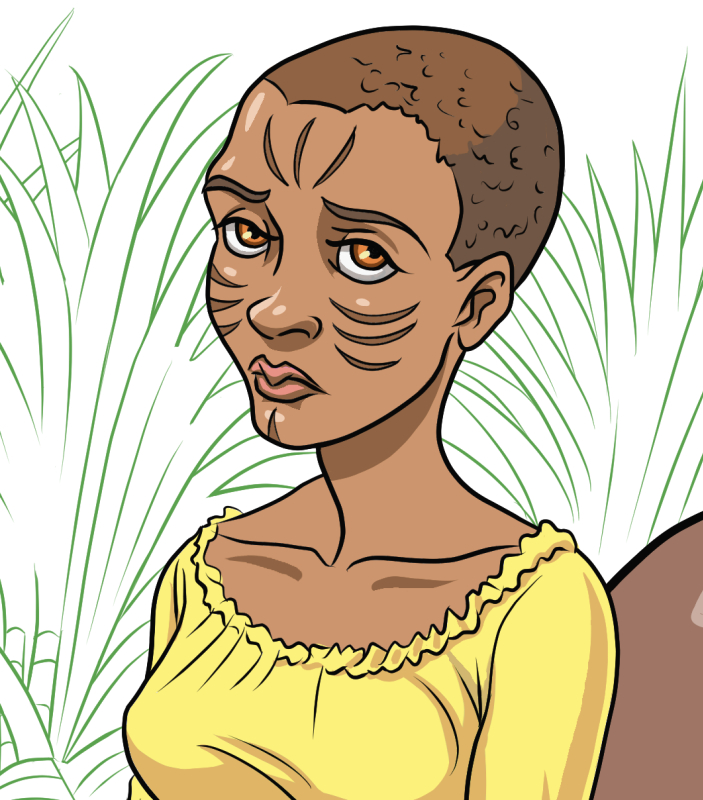
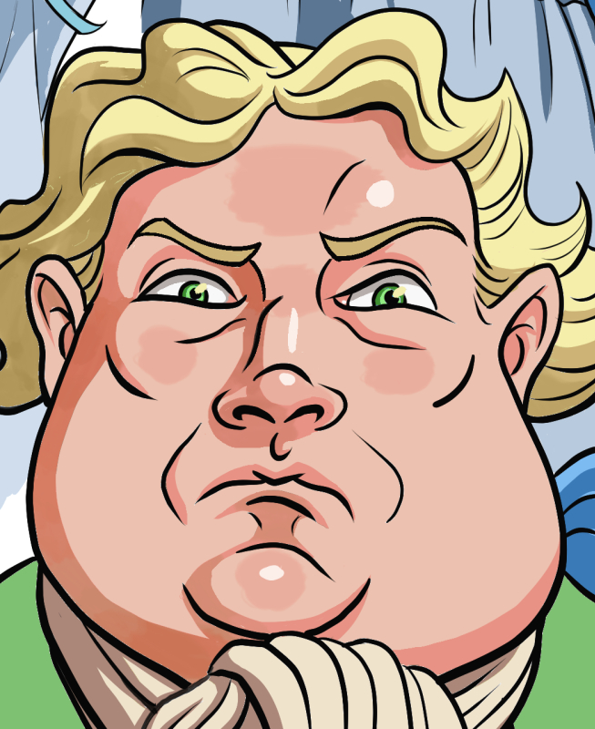
The colouring, as it turns out, was all in greyscale but I figured it would be a great workout nonetheless, maybe moreso than if it were full colour. Matt sent some of his completed pages as a guide. In a case like this, I think can be useful to mimic someone’s style, for learning and as a production skill.

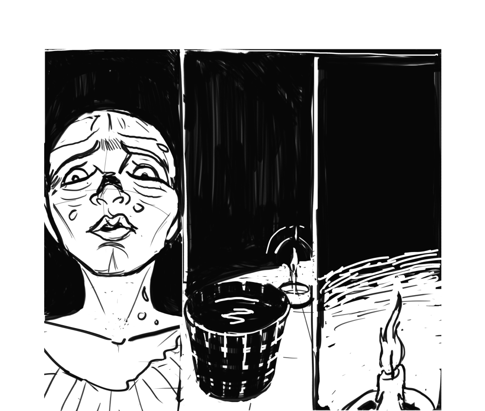
In the end, I completed the colouring of 65 pages. Of course, the curse of continual learning is looking back on something past and seeing things you would change. Still, it felt good to have contributed to this.

Below are some of the pages I was most proud of.

Check it out if you get a chance. Matt did a great job with the visuals! The book is also getting some great reviews: Buster, A Life in Pictures written by Ryan Barnett.

Sneak Peek of Green, Gold and Black

Back in August, I shared some character concepts for one of the stories to be included in Bedside Press's Gothic Tales of Haunted Love anthology which is slated to come out in early 2018. Now that I have some time, I thought I'd share some of the images from the pages of Green, Gold and Black, written by my friend, Cherelle Higgins, that doesn't give too much away.  The story is set in 1728 Jamaica when, on the eve of a slave uprising, a young house slave tries to protect her newborn infant from a pair of vengeful ghosts.

I wish I could share more because I feel I really pushed myself on this one, armed with some of the knowledge I've been slowly picking up from the Schoolism courses (I can't praise them enough), and also from years back at the Toronto Cartoonists Workshop where I learned how to break a script down into panel form from the wonderful Leonard Kirk! I didn't think I'd ever need to use that but while Cherelle has always written beautiful prose she didn't have any experience writing in comic form.  With Cherelle and Bedside Press's feedback I separated the text into panels as how I thought might best work with the amount of pages we were allocated. I even surprised myself by doing all the lettering and hand-drawn text bubbles. On my previous two comics, I was lucky to have my husband letter for me in Illustrator. He really enjoys this whole process but this time he had his own deadlines and couldn't assist. Having said that, he did volunteer to design a simple title for the story.

Below is the first page followed by a slideshow of some progression and early character sketches. I hope you enjoy!

Green-Gold-and-Black-Pg-001.jpg

Painting My Life Preview Issue Comic Cover

I was flattered to be asked to draw and ink an alternate comic cover for Canadian writer and filmmaker, Pasquale Marco Veltri. He wanted the cover for the preview issue of his graphic novel, Painting My Lifepencilled and inked by Ian Wright and coloured by Jorge Cortes

The creative brief I received was to have the main character, Alice, seated in the centre of a room, painting herself and everything in the room on canvas while gargoyles watch attentively nearby. He wanted the painted scene to be repeated in the painting within the painting. To increase the level of unease, he wanted the painting of the old woman on the wall to be repeated on most of the canvases, watching Alice work with varying levels of disapproval or dismay. This was a challenging image to work on because of all the elements and expressions. Because I'm a huge fan of animation and anime I took inspiration from some of my favourite shows and movies when designing the characters while trying to maintain the main characteristics of the characters I drew.  A mirror was always at hand while I acted out some of these poses and expressions!

While drawing this out in Clip Studio, I ended up adding in some flats for my own purposes to help me separate the foreground from the background. I'm not a typical penciller laying out shading and heavy inks because I often colour the page myself and so I was a little worried whether my pencils had enough information for the colourist but my fears were unfounded as he did a fantastic job! When I saw the finished version, I was surprised that his colour scheme was actually similar to my working flats. When I did my flats, I thought it would be nice to colour it later but then another project came up and it didn't look like I would have the opportunity anytime soon. 

Gothic Tales of Haunted Love

I'm super excited to be collaborating with my good friend, Cherelle Higgins, on a story she's written entitled: Green, Gold and Black. A story set in 1728 Jamaica, on the eve of a slave uprising. A young house slave tries to protect her newborn infant from a pair of vengeful ghosts.

Her story will be part of Bedside Press' Gothic Tales of Haunted Love comic anthology. There is a Kickstarter for it now so if you're into the spooky and romantic, please check it out!

Over the years, I've been fortunate to have read a lot of Cherelle's lush and imaginative stories, from cruel gods and goddesses to demons and angels, undead and other creatures I would never have imagined. She always manages to take a conventional theme and make it her own so I'm very happy she'll be getting another of her stories out there for others to read. If you haven't already, another story she wrote appears in the The Secret Lives of Geek Girls called Cherry where she tackles a past trauma. 

And now, some character concepts: 

Character Designs for a Comic

I've been busy working on a few projects in development but this is something I can share. My friend, Robert Iveniuk asked me to help him pitch a short comic called The Ruins with animals as the main characters. He knows my soft spot. 

Below are my interpretations of his characters: Kirby, a Schnauzer; Penny, a Beagle; and Gordon, an adorable Chow Chow, along with a group of hungry raccoons they encounter. I understand that the story is to be in black and white but I couldn't help but want to see what they would look like in colour. 

Update: Although our pitch did not make the final cut, (there were a large volume of submissions to the publisher) this doesn't necessarily mean that we won't do something with this in the future. In the meanwhile, I have been busy with other projects and commissions. I hope to share some of them soon. 

Romance Is in the Air

I was recently asked if I would be interested in working on something with a romance theme so I thought I would get in some practice by drawing screenshots of romantic TV shows I've watched. These particular shots were referenced from The Grand Hotel. It's a great show that had me hooked from the moment I started watching it. There's romance, comedy, and suspense, and the main actors have such great chemistry that I wanted to try my hand at capturing some of the intimate scenes. Drawing snapshots of scenes is a great way to learn composition, lighting, and story. 

I sketched a number of scenes using blue pencils. After posting up my drawings, it was suggested that I add some mood lighting so I brought them into Photoshop for inking and colouring. I decided to do a completely different take than what I saw in the first scene by using colours to suggest passion. I thought purples and pinks might be one way to go. One wouldn't think this would work but I think it did.

For the second image, I tried to interpret the existing lighting and colours into comic flats such as swapping out black hair with blue, etc. This was definitely a useful exercise. The more I draw something the more I hope to commit it to memory.