Recent Studies, Recent Art

Sorry for the lack of blog updates these past months! I decided early this year to focus my efforts on learning and creating more artwork to add to my portfolio, stores and Instagram pages. I’ve also been helping out an animator with an informational video on a tight deadline. I’ll talk more about that in an upcoming post.

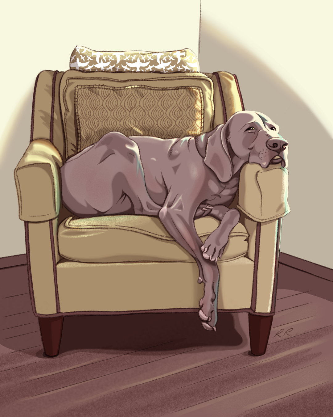
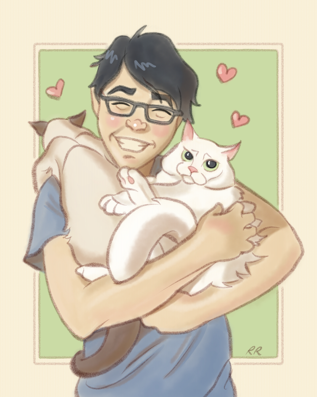
In order to produce more personal work, I began to set some time limits for myself for each piece and, as a result, I became much more efficient and produced more work in a few months than I did in an entire year. I realized a lot of what slowed me down in the past was overthinking things. Don’t get me wrong, I occasionally still do but I’ve been trying my best to push past it. I totally get that ubiquitous t-shirt phrase, Don’t Overthink It.

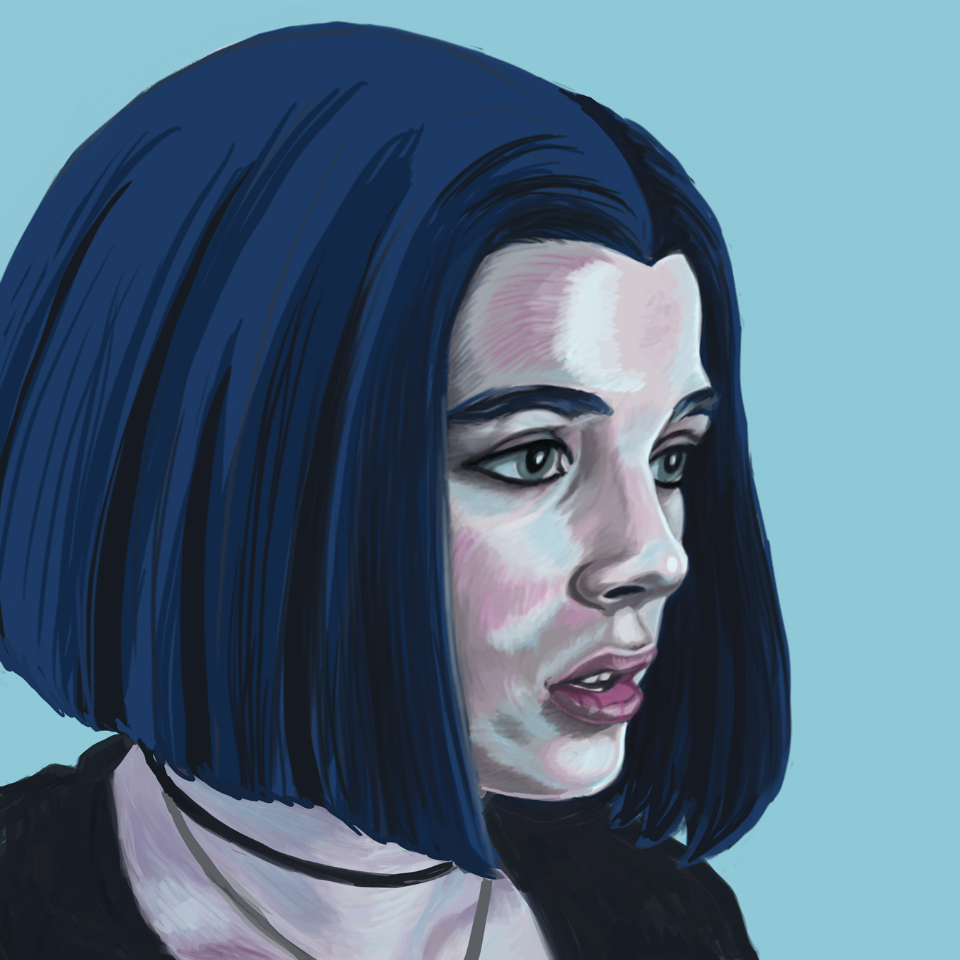
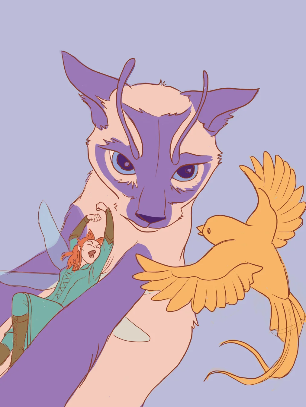
Letting go to draw whatever came to mind and trying out whatever style was also very freeing—I was coming up with ideas far more often. Too often, sometimes, but that’s a good thing, right? My main struggle these days is I have trouble trying to stick to a single subject matter and style because I love to explore. It would be nice to be recognized for my style. I’m not sure if I have one yet. Maybe one day.

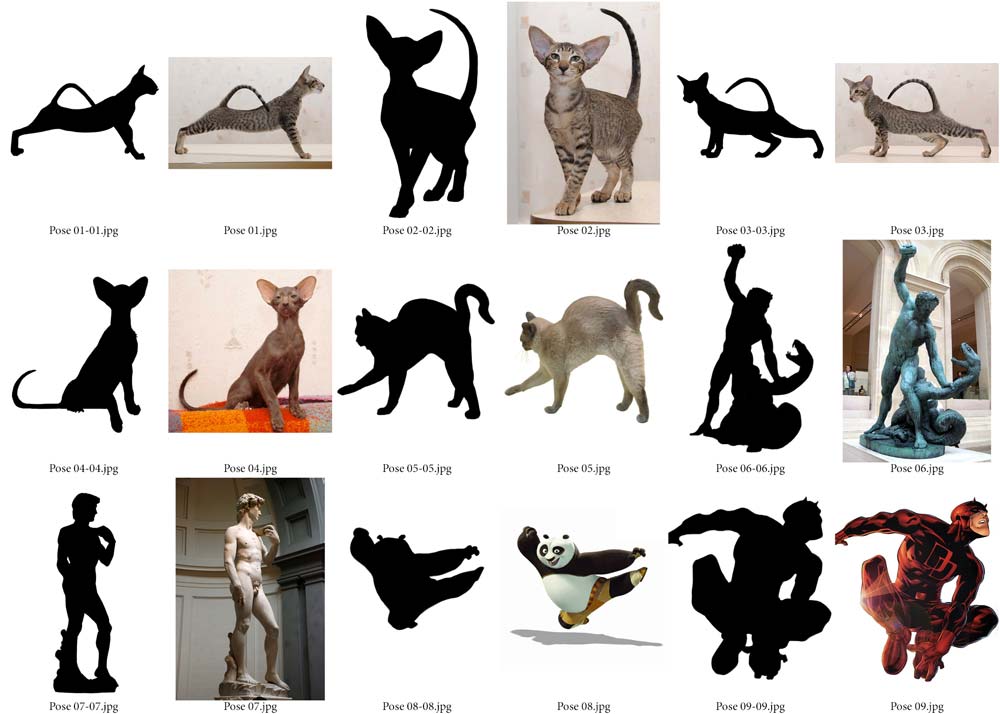
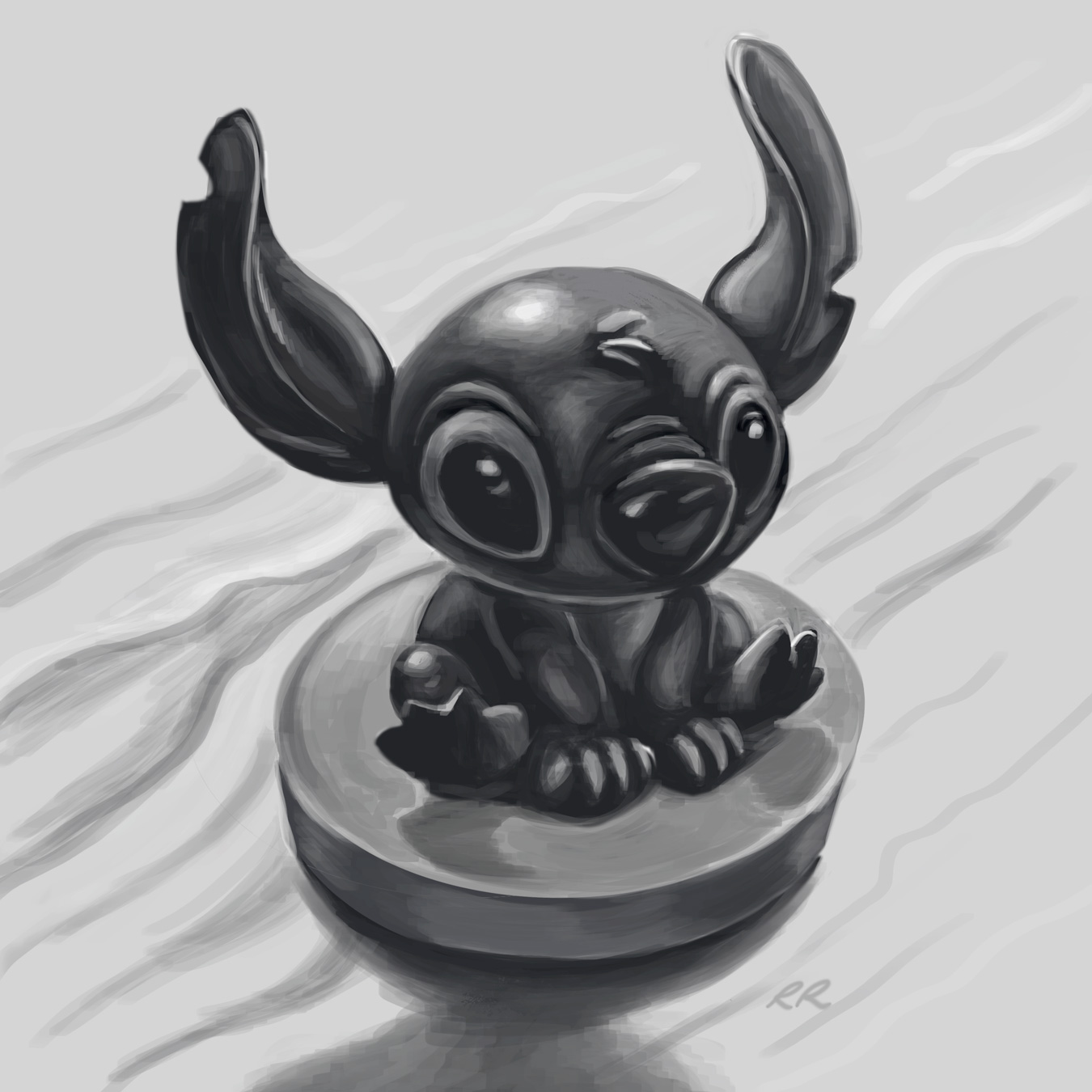
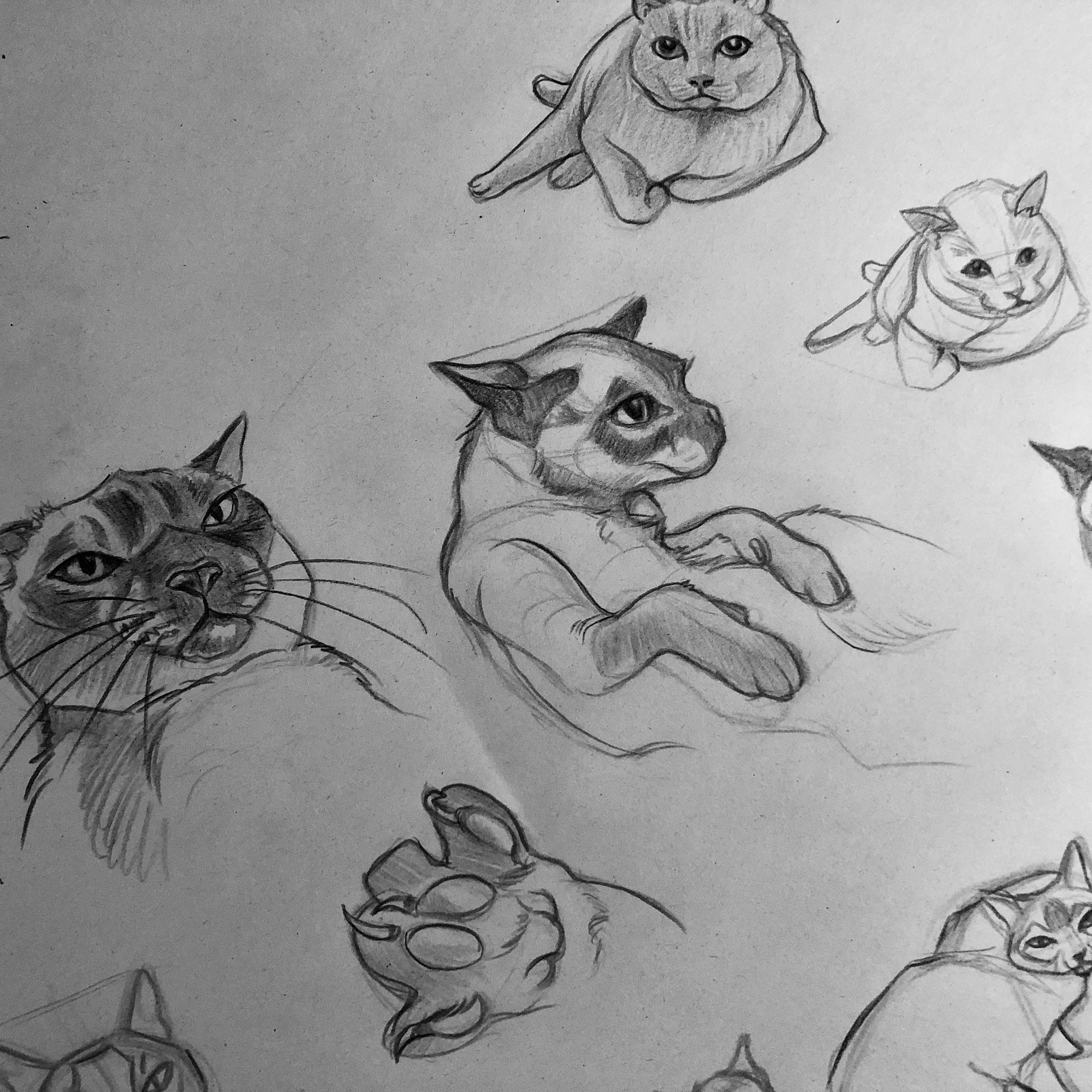
Because I’m constantly trying to increase my knowledge of technique, I followed some tips I picked up from my Schoolism classes and I started to do more light studies, studies of animals, action poses and backgrounds. I began to notice improvement to my finished pieces which I’ll save for another post. I felt like I was able to produce them a little more easily than I had in the past. Although I was pleased at how some of them turned out I know there will always be room for growth. I did start to think: Wow, did I really do that? There was a time when I would make numerous studies and still feel like I wasn’t advancing. I was embarrassed to share them so often I didn’t. To me they weren’t good enough—I made the mistake of comparing myself to others. We are often hardest on ourselves, right? I’ve since changed my perspective and instead try to learn from those artists I admire. Below are some of the studies I’ve been doing this year.

Light Studies:


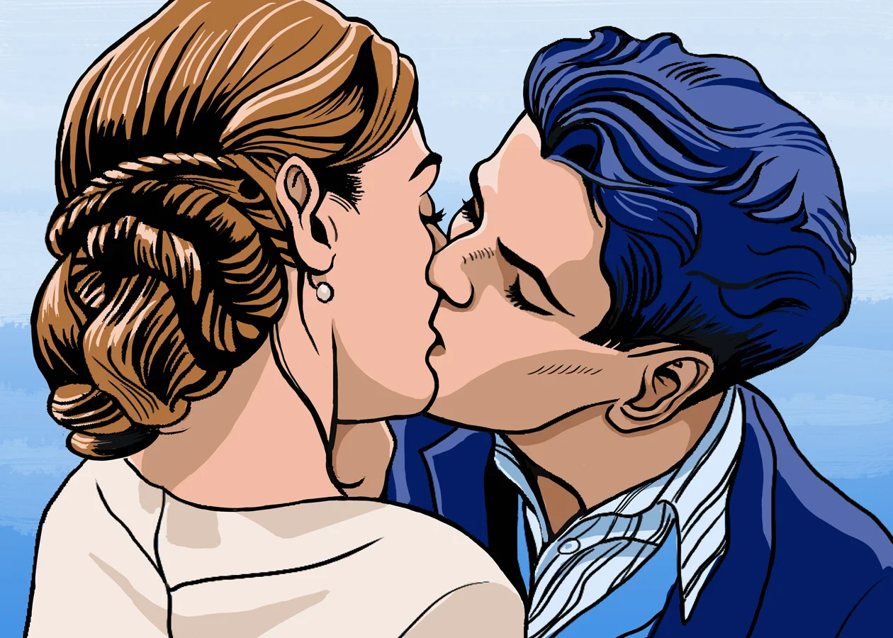
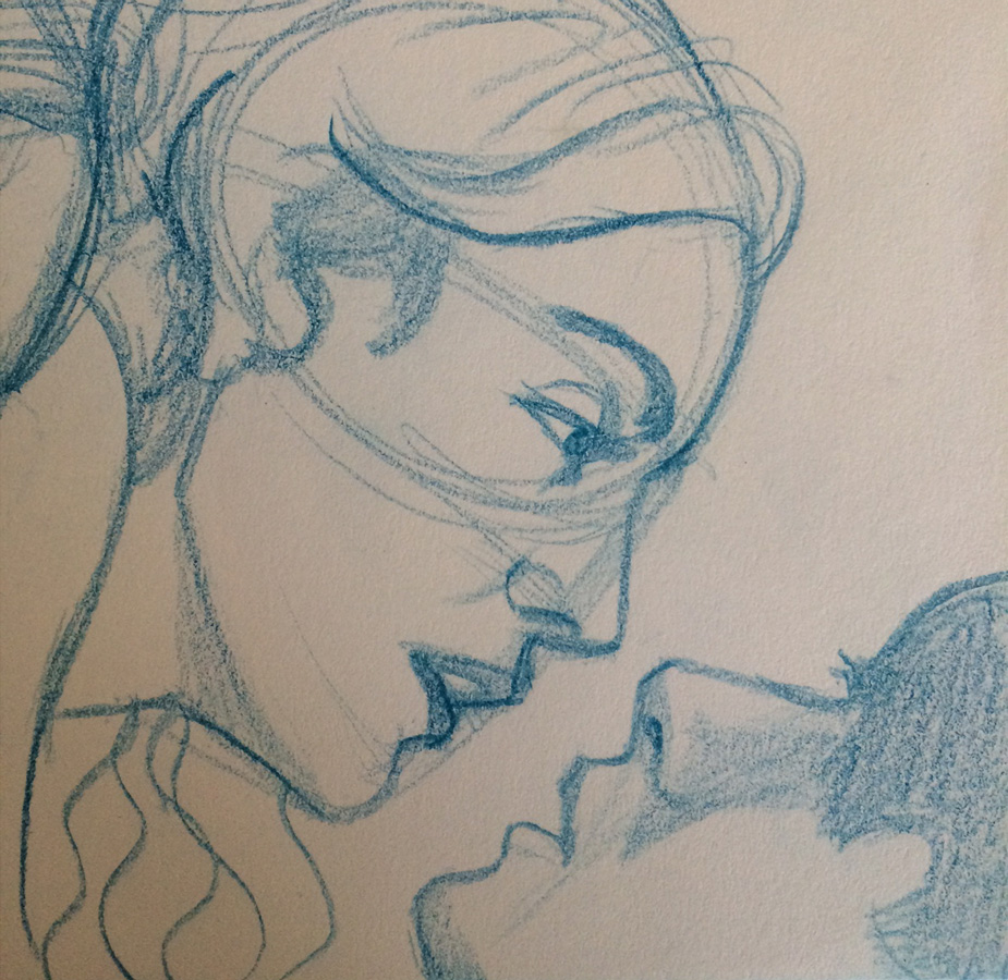
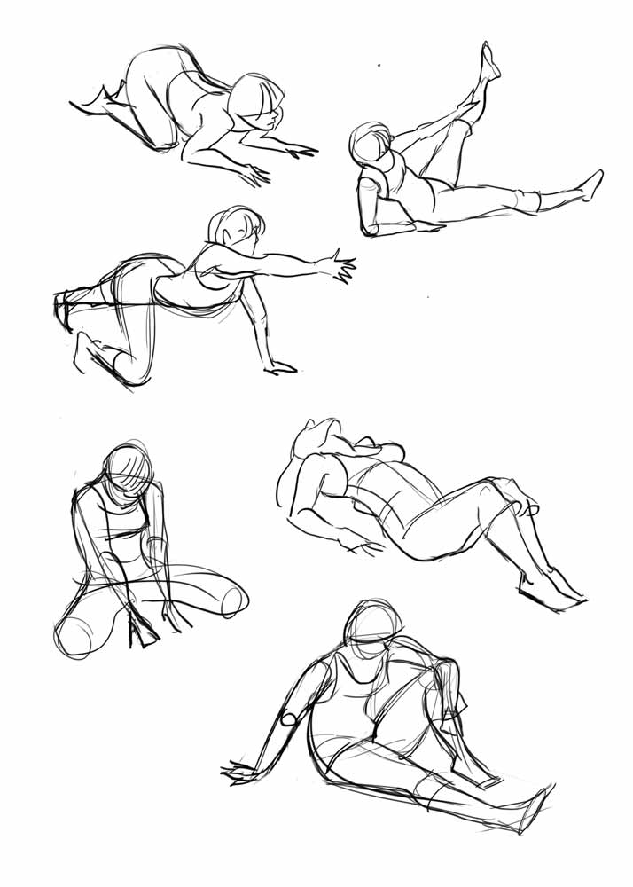
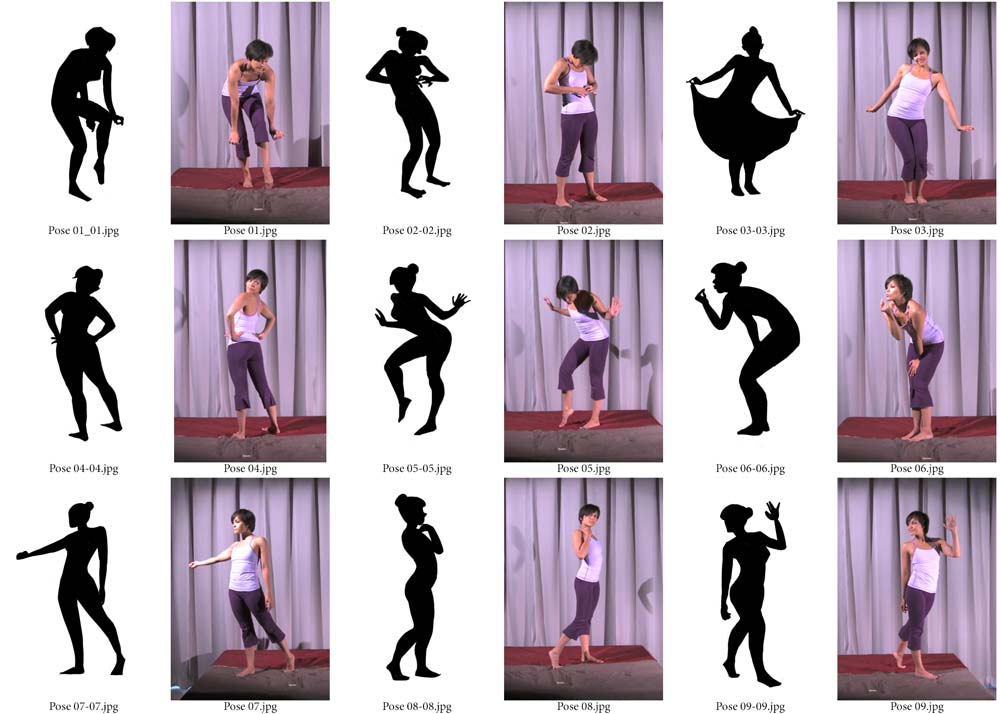
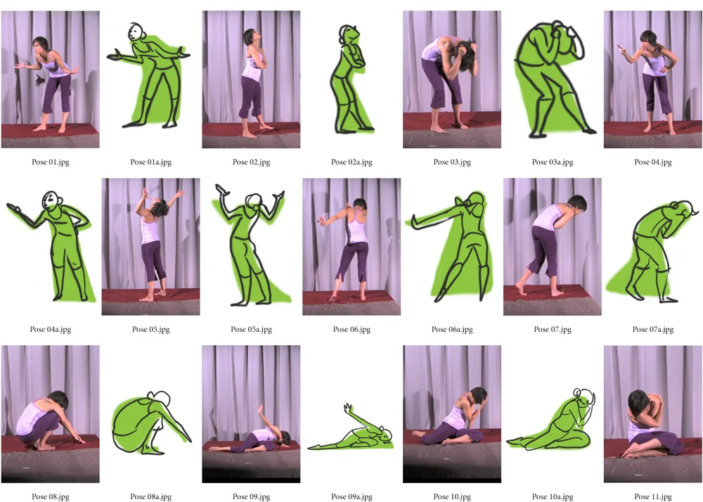
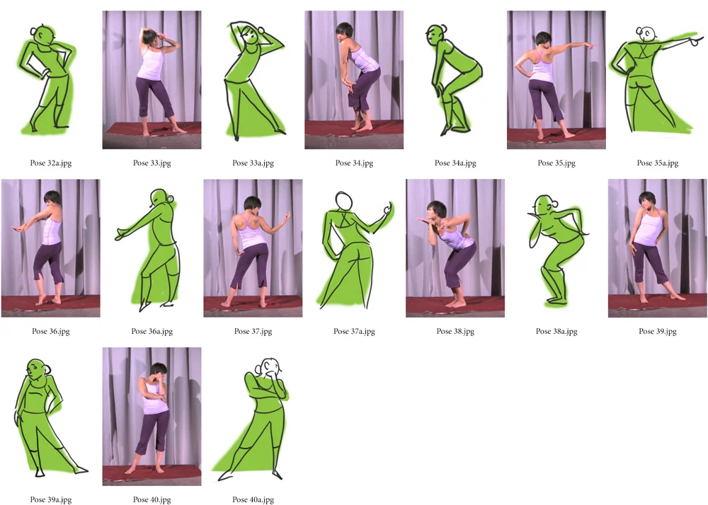
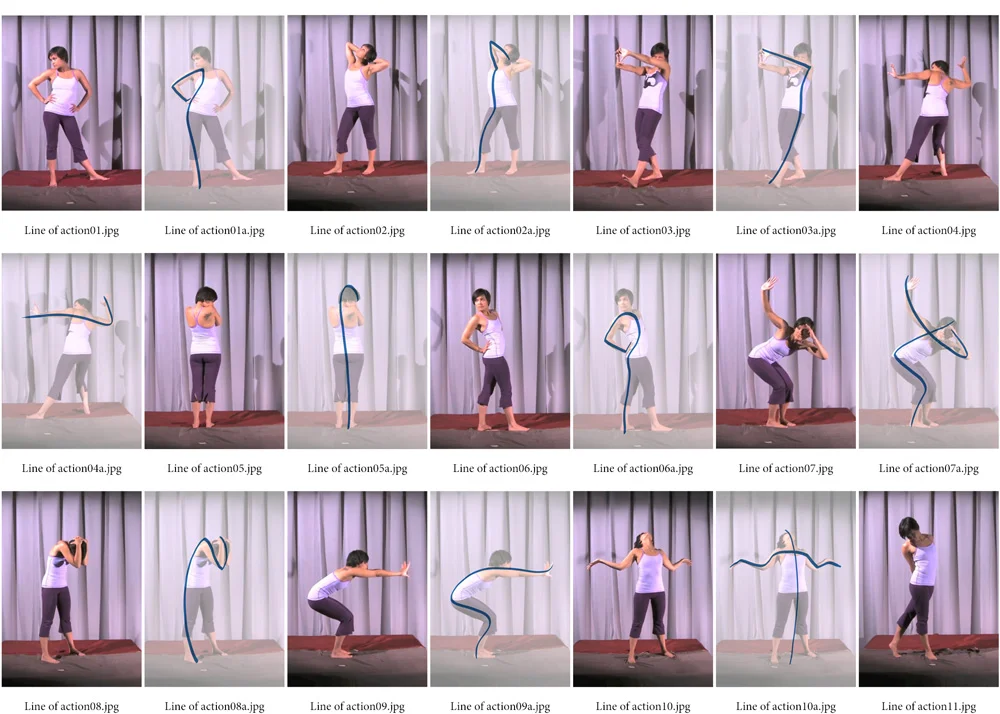
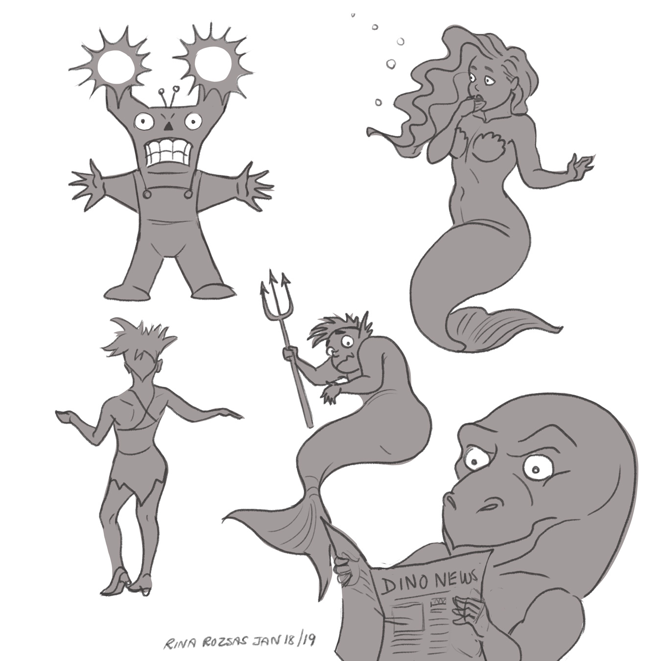
Exploration of Shapes, Expressions and Line of Action :

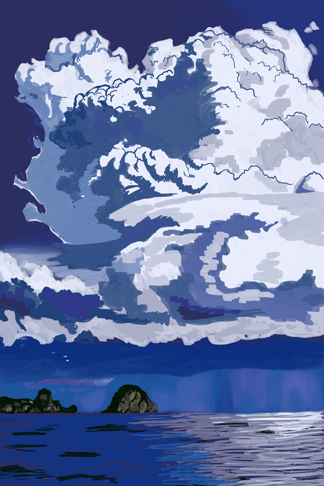
Landscape Studies From Photos and Paintings:

Animal Studies:

Thanks for looking!

Romance Is in the Air

I was recently asked if I would be interested in working on something with a romance theme so I thought I would get in some practice by drawing screenshots of romantic TV shows I've watched. These particular shots were referenced from The Grand Hotel. It's a great show that had me hooked from the moment I started watching it. There's romance, comedy, and suspense, and the main actors have such great chemistry that I wanted to try my hand at capturing some of the intimate scenes. Drawing snapshots of scenes is a great way to learn composition, lighting, and story. 

I sketched a number of scenes using blue pencils. After posting up my drawings, it was suggested that I add some mood lighting so I brought them into Photoshop for inking and colouring. I decided to do a completely different take than what I saw in the first scene by using colours to suggest passion. I thought purples and pinks might be one way to go. One wouldn't think this would work but I think it did.

For the second image, I tried to interpret the existing lighting and colours into comic flats such as swapping out black hair with blue, etc. This was definitely a useful exercise. The more I draw something the more I hope to commit it to memory.

Schoolism - Pictorial Composition - Week 1, Engaging Your Audience

I often wonder if I've hit all the marks with a piece I've worked on so I decided to take Pictorial Composition with Nathan Fowkes because I know that it's an important aspect to making a successful image.

Nathan said, "Artwork is made up of rendering, colour and composition." He shared that we all have a tendency to focus on the first two but, without composition, an image can lack depth and fall flat. Colour is the frosting while composition is more of a fight. We need to learn what to emphasize or leave out. The course would cover what makes an image a compelling and engaging piece. 

This week's assignment began by putting together a reference file of images of any kind that inspire and move us: frame captions, photography, animation, or films that we felt had a pleasing composition. Of 3 images we were asked to paint copies but in a specific way. We were to deconstruct them to find out what made them tick. I chose one background painting from Studio Ghibli's Spirited Away (art by Kazuo Oga), one painting by Lord Frederick Leighton, and one painting by Frank Frazetta.

How we went about deconstructing them:

  1. Create a quick study of each that uses only 3 greyscale values to depict the original scene. No soft edges, no textures, just 3 values forcing you to think and make clear choices on what to edit and why. It reminded me of gesture drawing where you must quickly put down the essence of what's important. One should be able to tell at a glance what's going on in the picture.
  2. Make a full-range greyscale study of the same images, maintaining the strength and intent of the originals while minimizing extraneous detail. Again, no textures, just the guts. This was tough because I normally love to add detail; I had to constantly remind myself not to do that.
  3. Lastly, do another study, almost the same as the previous step, albeit in full colour. Each study was to be made in under an hour.

I'm not sure if I was completely successful but I feel like I already learned some valuable tips that I'll keep in mind for future projects.

Schoolism - Gesture Drawing Week 4

I've been behind in posting for various reasons, one of which is because I have been working on some art projects. Having said that, I've delayed long enough and should finish up my assignment and move onto Week 5 for the next topic.

Week 4 was about space, or creating spacial depth in our gesture drawings. We were given 1-minute timed poses to draw but this time we were told to strengthen the feeling of space within the drawing. This could be as simple as moving a foot or leg back, an arm forward, etc. Midway through the exercise we were told to switch to our non-dominant hand and follow the same rules. I went a little over the 1-minute mark for almost all the poses but even more so with my right-handed drawings. To be honest, I was lucky if I had enough control to draw a head in that time let alone change up the pose!

We were also asked to do about 2 hours worth of cafe sketching using both the dominant and non-dominant hand. However, lucky me, I managed to catch the flu this time and I still needed more practice drawing cats, so I chose to draw...my cat. I did manage to sneak in a drawing of my hubby but my right-handed drawing looks nothing like him; I unintentionally made him look like a 12-year old. Teehee! :)

Schoolism - Gesture Drawing Week 3

This post is a little delayed because I took some time off during the Toronto Film Festival. The film festival is a lot of fun, particularly the Midnight Madness portion, but can be a little exhausting with a lot of late nights!

Week 3 was all about creating strong readable silhouettes. For the first assignment we went through timed poses of 1 minute each which seemed a luxury after the previous assignment's 30 second poses. That is, until I realized that a lot of the poses would not make strong silhouettes without some modification, and it often took me a few tries to get it right. I admit that I often went over the allotted time which was a little frustrating. Regardless of my failures, the bright side is that I am drawing much more and so many more poses that I feel that I'm learning at a faster rate.

For the second assignment, we created silhouettes from either 10 photos, movies or pieces of art. I chose to do a couple more because I was having so much fun. I really enjoyed learning from these, especially Joe Quesada's Daredevil and Avatar's Korra. It's hard not to be motivated with such interesting and dynamic poses!

The final assignment was more café sketching but this time using silhouettes. Because of my upcoming project involving a cat and because I've been a little under the weather this past week, I chose instead to draw my little honey-bun, Dax. :)


Schoolism - Gesture Drawing Week 2

This week we covered shapes where the goal was distillation or breaking things down to their essential forms. One of the assignments was to first sketch/paint out the basic shape for each pose from the provided video with each pose timed for 30 seconds. I used to think that 1‑minute poses were short but when each pose is such a short duration you find you have no choice but to get down to the bare essentials and quickly. We were to through the video again, quickly sketching out each pose but this time using the shapes we drew as a guide. Exaggeration or pushing the pose was encouraged; it's something I need to improve upon. This was a challenging exercise and really made me see things in a different way.

In the next exercise we had to find basic shapes using either 10 paintings or photos. I decided to use the same paintings and movies I posted from the previous week and, in some cases, I reconsidered some of my main lines of action.

For the last exercise, we were asked to do 2 hours of café sketching. Because I've been asked to work on a comic involving a cat as the main character, I decided to kill two birds with one stone and instead do cat sketching. I have to say that 30 seconds now seems like a luxury when trying to draw a very active pet.

My next post will be a little late because I'm taking some time off for the Toronto International Film Festival. 😁

Schoolism - Gesture Drawing Course - Week 1

On the advice of my previous instructor, I decided to sign up for Gesture Drawing with Alex Woo. For week 1, we were to ask ourselves what the pose was about and how to best represent it as a line. Here are my assignments for week 1 on the 'Line of Action'. I can already see value in it as a way to keep poses from looking too stiff.

Schoolism - Foundation Studies Course, Weeks 2 and 3

Below are my assignments for week 2 on 'the Power of Value'. I chose to work traditionally on paper.

For the angel, I first experimented with harder pencils on a 90lb medium-tooth paper and while it is close to the tone of the original photo, I would have liked to have gone a little darker. I felt it was already little overworked and I didn't want to take any chances of wrecking it and having to start over. I'm told that harder pencils tend to work better on art board, so I may try that another time. The assignment was to copy the sample greyscale photos and either get as close to the values we saw or change the lighting entirely. I chose to draw what I saw because I wanted to learn from it.

For the lion I chose to not be so concerned with all the little details and just get the essence down. In the original photo, the lion's mane is a mass of detail. I also decided to experiment with pencil crayons on brown craft paper which was a lot of fun but I still felt that I could have pushed the darks more had I used conté or soft pencils instead. 

For week 3 on 'the Power of Perspective', we were asked to draw or paint in greyscale using a couple of provided photos. The greyscale of the White House is from an old black and white photo and the La Gondola photo was originally in colour. For speed I chose to paint both in Photoshop. Below are my efforts. 

The balcony portion of the White House picture was a little tricky to draw because the building is almost parallel to the picture plane and so close to the horizon line that it made drawing a test of patience. I originally thought it was a cylinder set halfway inside the building but upon googling it, I discovered that it's not quite a half cylinder so I ended up eyeballing it while keeping it aligned to the perspective I set. I did make the perspective slightly different than the photo where the right vanishing point is further out and I gave the White House a little more breathing space around it and added some more trees. The La Gondola picture was also challenging because of the various elevations of the buildings and the three-point perspective. I resisted the urge to cheat and use Manga Studio. :) All in all, these were great exercises. I think I'm getting more comfortable painting in greyscale so that's a plus.