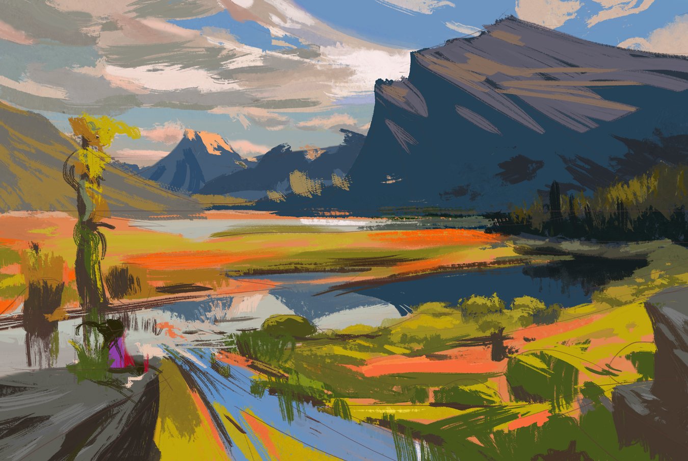
21-day Environmental Design workout by Nathan Fowkes
As an illustrator I’m often asked to draw or paint a variety of things so continual learning is a must.
Backgrounds are a skill I always felt I could improve so I decided to finally put my head down and try and plow through the 21-day Environmental Design workout by Nathan Fowkes offered by Schoolism, an online subscription-based artistic education. It probably won’t be my last as it was definitely an eye-opener to all the different approaches of backgrounds Nathan showed.
With the exception of a few lessons, each video was approximately an hour long. Nonetheless I found it took me much longer to paint, sometimes 3 to 4 hours or more. Following Nathan was a bit of a challenge for me as he flit about the digital canvas, rapidly changing brushes, and following along the applied adjustment layers. I found myself pausing and rewinding often.
While Nathan doesn’t provide the brushes themselves, he walks you through most of his settings. When the opportunity arose, it was easy enough to take a snapshot of the brush on screen and duplicate the configuration. One thing I noticed that would occasionally throw me off was brush strokes suddenly appearing as if some frames leading to them had been dropped although the narration did not suffer from it. I would rewind to see if I blinked but I chalk it up to creative editing.
While the style is different than what I’m used to, I found it to be quite educational and will definitely incorporate some of the things I learned into my own work. Below are a handful of the studies I did of Nathan’s compositions. I don’t want to spoil it for others taking the course. I painted these all in Photoshop.


