Digital Painting with Bobby Chiu

I recently completed another course through Schoolism: Digital Painting with Bobby Chiu. I’ve had access to these courses for a while but between personal and client work, the challenge has always been motivating myself to actually go through them. In the past—when I did have time—I’d just skim the videos to try to apply it to my own work. However, I am encouraging myself to put in the extra effort to do the assignments and pay more attention to the lessons.

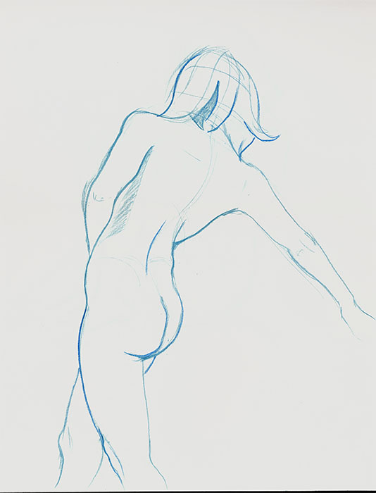
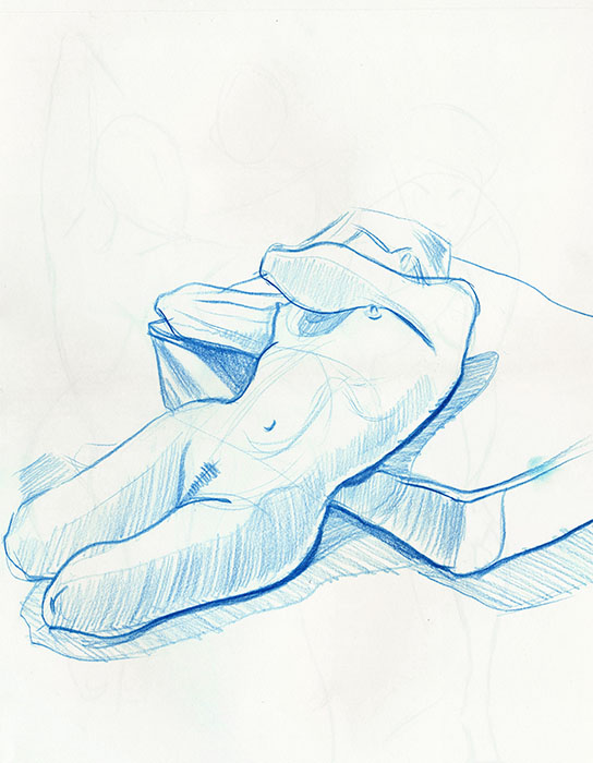
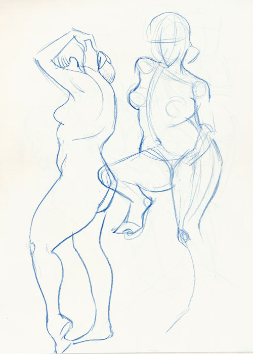
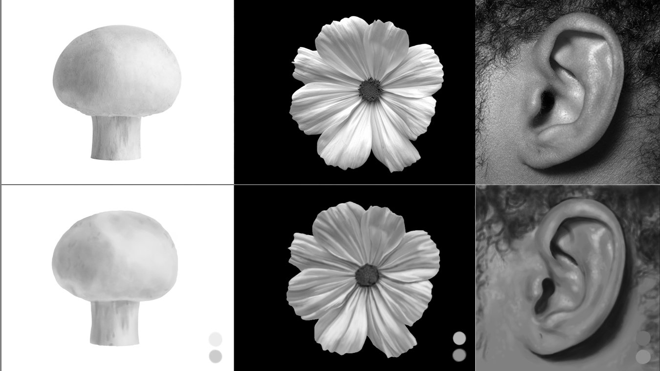
The lessons start off with foundational greyscale studies of objects and people, most of them timed. In one lesson, I drew the same girl 8 times in different orientations using the provided photo reference, then ultimately from memory. She definitely was burned into my brain by the end of it. Repetition is a great way to get to know your subject. In another of the timed lessons, a photo of Kim Jung Gi’s was referenced. The one on the left is Bobby’s where he prepared the under-drawing, curves and adjustment layers for us to paint in the highlight and darks; the one on the right is mine, drawn from scratch in about an hour.

Subsequent lessons focused on adding colour on top of the greyscale images Bobby created (you’ll probably recognize his iconic style in the fungi man and lizard creature). These were lots of fun to practice on.

I completed all of the lessons and, like in some of my posts, I will show only some of the results so I don’t give it all away.

Lessons 1 and 2: greyscale studies using a hard round brush with low flow and opacity

Lesson 3: Timed photo studies of Kim Jung Gi (the image on the right is mine done from scratch) I’m a lefty so placing the photo on the right was much easier for me.

Lesson 4: Applying colour to Bobby’s greyscale characters

Lesson 6: 20-minute greyscale studies from provided photos.

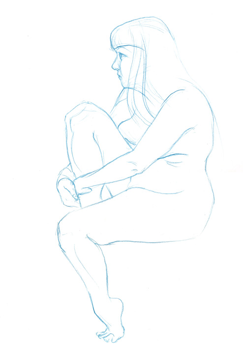
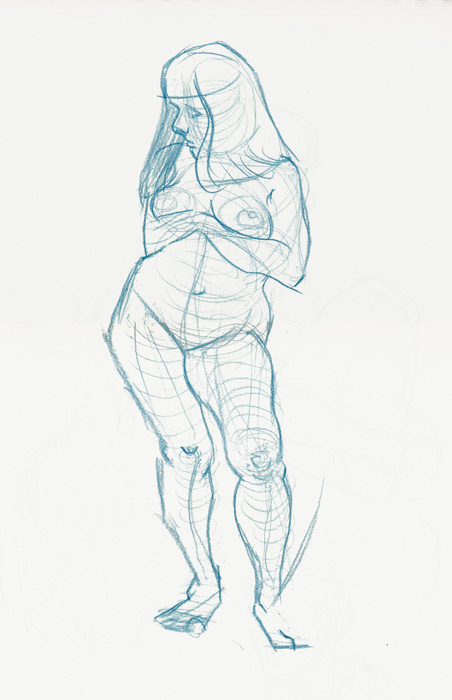
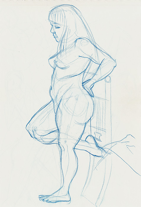
Inspired by the lessons I decided to take one of my character sketches and apply what I’d learned in this class. I may make a collection of these plant creatures.

21-day Environmental Design workout by Nathan Fowkes

As an illustrator I’m often asked to draw or paint a variety of things so continual learning is a must.

Backgrounds are a skill I always felt I could improve so I decided to finally put my head down and try and plow through the 21-day Environmental Design workout by Nathan Fowkes offered by Schoolism, an online subscription-based artistic education. It probably won’t be my last as it was definitely an eye-opener to all the different approaches of backgrounds Nathan showed.

With the exception of a few lessons, each video was approximately an hour long. Nonetheless I found it took me much longer to paint, sometimes 3 to 4 hours or more. Following Nathan was a bit of a challenge for me as he flit about the digital canvas, rapidly changing brushes, and following along the applied adjustment layers. I found myself pausing and rewinding often.

While Nathan doesn’t provide the brushes themselves, he walks you through most of his settings. When the opportunity arose, it was easy enough to take a snapshot of the brush on screen and duplicate the configuration. One thing I noticed that would occasionally throw me off was brush strokes suddenly appearing as if some frames leading to them had been dropped although the narration did not suffer from it. I would rewind to see if I blinked but I chalk it up to creative editing.

While the style is different than what I’m used to, I found it to be quite educational and will definitely incorporate some of the things I learned into my own work. Below are a handful of the studies I did of Nathan’s compositions. I don’t want to spoil it for others taking the course. I painted these all in Photoshop.

Schoolism - Pictorial Composition - Week 1, Engaging Your Audience

I often wonder if I've hit all the marks with a piece I've worked on so I decided to take Pictorial Composition with Nathan Fowkes because I know that it's an important aspect to making a successful image.

Nathan said, "Artwork is made up of rendering, colour and composition." He shared that we all have a tendency to focus on the first two but, without composition, an image can lack depth and fall flat. Colour is the frosting while composition is more of a fight. We need to learn what to emphasize or leave out. The course would cover what makes an image a compelling and engaging piece. 

This week's assignment began by putting together a reference file of images of any kind that inspire and move us: frame captions, photography, animation, or films that we felt had a pleasing composition. Of 3 images we were asked to paint copies but in a specific way. We were to deconstruct them to find out what made them tick. I chose one background painting from Studio Ghibli's Spirited Away (art by Kazuo Oga), one painting by Lord Frederick Leighton, and one painting by Frank Frazetta.

How we went about deconstructing them:

  1. Create a quick study of each that uses only 3 greyscale values to depict the original scene. No soft edges, no textures, just 3 values forcing you to think and make clear choices on what to edit and why. It reminded me of gesture drawing where you must quickly put down the essence of what's important. One should be able to tell at a glance what's going on in the picture.
  2. Make a full-range greyscale study of the same images, maintaining the strength and intent of the originals while minimizing extraneous detail. Again, no textures, just the guts. This was tough because I normally love to add detail; I had to constantly remind myself not to do that.
  3. Lastly, do another study, almost the same as the previous step, albeit in full colour. Each study was to be made in under an hour.

I'm not sure if I was completely successful but I feel like I already learned some valuable tips that I'll keep in mind for future projects.

Life Drawing

Below are some life drawings from a few sessions at Kagan McLeod's studio who is a pretty well-known illustrator .

While drawing, I almost always feel like my proportions are wrong but when I've had a chance to step back I'm often surprised that the sketches turn out better than expected.  I still have to work on getting in those 10,000 hours.

Tonkinese study

As I have some upcoming pet portraits to work on, I decided to do a little practice drawing of a Tonkinese cat from photo reference.  My cat happens to be a Tonkinese - wonderful little guy but doesn't seem to like having his picture taken.  Thank God for the internet and Google! ;-)