A character design for a graphic novel

The story part of my friend's graphic novel is complete so I thought I'd post up a character design I did last week of the protagonist. At her request, I did a rough front pose in colour. Alas, the project has taken another direction and I am no longer a part of the process. C'est la vie.

Tonkinese study

As I have some upcoming pet portraits to work on, I decided to do a little practice drawing of a Tonkinese cat from photo reference.  My cat happens to be a Tonkinese - wonderful little guy but doesn't seem to like having his picture taken.  Thank God for the internet and Google! ;-)

Concept art for a short film 'Insect' - the reveal

I was given the go-ahead by the director to show the full concept art piece so I've attached it below along with all the steps taken to create the piece.

  1. Based on the script, I made a number of  small rough thumbnails with various layouts to present for approval.  I was sent some reference photos of character types envisioned for the film.
  2. On the poster shoot, the director chose one thumbnail with which to proceed. The model, Alex, turned out to be a candidate for the lead role, so I used her likeness from the photos taken by my husband, the official still photographer. At this point, I moved into blocking in the room, chairs and mannequins in perspective.  Once I was happy with it, I began to make the mannequins look like the characters, adding clothing, wings, bloody stumps, etc. Normally, I would have put the light into perspective but as we were not sure where the light source(s) would be located I wasn't too concerned.
  3. The director needed something to show the special effects crew (The Butcher Shop) so I scanned it at 300 dpi and brought it into Photoshop for digital inking, throwing in a brownish background colour by using multiply on the colour layer and another layer to paint in some quick highlights, and sent it off to her to show the FX crew.
  4. Later on, the script was further tweaked requiring some changes to the artwork including a complete re-inking. Once I was satisfied, I added colour.

The film was shot last Saturday and l got to help out on the set as Assistant PA in Craft Services (a.k.a. Food Services).  It was a long 14-hour day spent mostly in quiet and darkness and I now have a new appreciation for what goes into making a movie.  It was quite exciting to be a part of it all and to see my concept art brought to life by Carlos Henriques & Ryan Louagie, the prosthetics team. They did an amazing job transforming Tyler Williams into the Angel.  I can't wait to see the finished film!

For more information about the movie and to get an early look at it please visit www.bull-dogpictures.com.


Dog portrait commission completed

I finished the commission in time for Valentine's Day and the client was extremely pleased (yay!).  As you can see, I spent most of my time refining the image in the last stage. That's really what you want to do at the end, just dotting your i's and crossing your t's, artistically speaking. The wrap-up should be reasonably stress-free. On that note, I hope everyone's Valentine's Day was also stress-free. :)

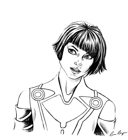
Quorra (Step 2 - Ink)

I just finished step 2 of Quorra. During (digital) inking I noticed areas that needed some changes and I think they help to make her look a little more like the original reference. I also added more of her body to the portrait. I plan on colouring it later.

Quorra

I came back from a showing of TRON: Legacy and was inspired to draw one of the characters. I used a publicity still for reference. Enjoy!

Dessert - It's finally finished!

An elven girl searches a cave looking for a special flower to heal her ailing brother and in using her powers to illuminate the cave awakens a sleeping dragon that has made it his resting place.

This has been the one of the most challenging pieces I've ever done but I think the effort and time was worth it because of all that I've learned through the process. Hopefully it will make future pieces a little less painful. ;-)

All Hail Divine Nibru!

Recently, I came across a posting at www.conceptart.org via an email from Jason Manley. A user had put out a request - a creative challenge to see some interpretations of his beloved character, the Divine Nibru.  What followed was some impressive responses from various artists, including none other than Wesley Burt, Justin "Coro" Kaufman, and Andrew Jones, to name a few. It was epic. My week at work had been unbelievably busy so I wasn't sure if I would have the time or energy to work on my version before the thread lost momentum but I couldn't get this character out of my head and I would check back often to see so many great follow-up posts. The weekend rolled around and I finally found some time to work on it so I decided to contribute a version of my own. I noticed that most people posted theirs in greyscale and I decided to do the same even though it's an area in which I'm a little weak especially when working from imagination. Although I felt it wasn't complete, I just wanted to get it posted. I learned a lot and, taking a step back, have a better idea of my shortcomings in this area and what I need to improve on. This was an excellent exercise in being given an assignment that both restricted and challenged my creativity and, most importantly, it was a lot of fun!

For any beginning artists these challenges are great in showing ourselves our limitations and pushing beyond them or figuring something out to achieve the creative objective. In a real working project you would have an art director to give you feedback and opportunity to make improvements. In the meantime, communities such as ConceptArt have thriving memberships that do fill that role while we are still learning.

This is the author's thread. My contribution is below and here is my entry in the thread.