Sabrina - steps 1 and 2 (clean-up and ink)

As the client has made her selection of the pose and composition she prefers, I begin cleaning up the thumbnail by placing tracing paper over the initial sketch and overlaying rough perspective lines in blue. I cheat a little on the perspective as it's not necessary to be 100% accurate for this piece so I don't bother agonizing over lines being a little off.  I've been told that as long as it looks correct, it is correct - at least to the viewer.  Mind you, in something more obvious, I would take more care. I follow this by outlining the shapes of the character in red so as not to get mixed up with the perspective lines drawn. Something else I learned is that it's easier to work with perspective on a thumbnail or smaller picture than at full scale and having to break out the extra long rulers! ;-)

Once happy with the layout, I outline the cat and bed in pencil and add some light shading.  At this point, I scan it in and bring it into Photoshop for inking which I do on a separate layer above the scanned image.

Sabrina commission thumbnails

Now that I've moved and my office is less of a disaster zone, I thought I'd attach some thumbnails I completed for my friend's pet portrait commission. It's been on hold for a while for various reasons but I will now be resuming and plan to post pics of the progression.

Life drawing at the TCW

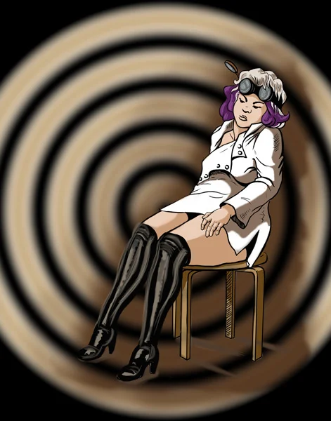
I'm making an effort to go life drawing again as it's one of the things I regret not spending enough time doing. I know it's a good exercise to keep up with as it trains you to solve problems quickly and, in turn, helps to increase the speed with which you draw. I find life drawing is a lot like working out. The more you do it the better the results. And like working out, it's hard to get past those first few times. My first session was no less discouraging as my drawing of the pretty lady turned out looking more like something that was dragged from the pit so I'll spare you the posting of that. Instead, I've posted something from my most recent open life drawing session at the Toronto Cartoonists Workshop.

They had a costume for the latter half of the session which I think added an element of fun plus it's good to practice drawing drapery. I've taken one of the poses and started to add colour and play around with it a bit.  I'm not sure where it will go but sometimes it's just about the journey.

Tonkinese study

As I have some upcoming pet portraits to work on, I decided to do a little practice drawing of a Tonkinese cat from photo reference.  My cat happens to be a Tonkinese - wonderful little guy but doesn't seem to like having his picture taken.  Thank God for the internet and Google! ;-)

Concept art for a short film 'Insect' - the reveal

I was given the go-ahead by the director to show the full concept art piece so I've attached it below along with all the steps taken to create the piece.

  1. Based on the script, I made a number of  small rough thumbnails with various layouts to present for approval.  I was sent some reference photos of character types envisioned for the film.
  2. On the poster shoot, the director chose one thumbnail with which to proceed. The model, Alex, turned out to be a candidate for the lead role, so I used her likeness from the photos taken by my husband, the official still photographer. At this point, I moved into blocking in the room, chairs and mannequins in perspective.  Once I was happy with it, I began to make the mannequins look like the characters, adding clothing, wings, bloody stumps, etc. Normally, I would have put the light into perspective but as we were not sure where the light source(s) would be located I wasn't too concerned.
  3. The director needed something to show the special effects crew (The Butcher Shop) so I scanned it at 300 dpi and brought it into Photoshop for digital inking, throwing in a brownish background colour by using multiply on the colour layer and another layer to paint in some quick highlights, and sent it off to her to show the FX crew.
  4. Later on, the script was further tweaked requiring some changes to the artwork including a complete re-inking. Once I was satisfied, I added colour.

The film was shot last Saturday and l got to help out on the set as Assistant PA in Craft Services (a.k.a. Food Services).  It was a long 14-hour day spent mostly in quiet and darkness and I now have a new appreciation for what goes into making a movie.  It was quite exciting to be a part of it all and to see my concept art brought to life by Carlos Henriques & Ryan Louagie, the prosthetics team. They did an amazing job transforming Tyler Williams into the Angel.  I can't wait to see the finished film!

For more information about the movie and to get an early look at it please visit www.bull-dogpictures.com.


Sketch at a café

After the TCAF (Toronto Comic Arts Festival) and some art supply shopping, the hubby and I stopped at a gallery/café across from the AGO.  I wanted to try out my new mechanical blue pencil so drew a quick sketch of Victor.  He wanted to try out his new brush pen so inked it.  Here is the result.  I think we make a good team.

Dog portrait commission completed

I finished the commission in time for Valentine's Day and the client was extremely pleased (yay!).  As you can see, I spent most of my time refining the image in the last stage. That's really what you want to do at the end, just dotting your i's and crossing your t's, artistically speaking. The wrap-up should be reasonably stress-free. On that note, I hope everyone's Valentine's Day was also stress-free. :)

Dog portrait commission - Part 2

Attached are some more steps in the process. Keep in mind I'm not a paid professional - yet! - so my steps aren't necessarily the right way but what I felt comfortable with and still gave me a sense of organized process. In the first image, I painted out the fur, varying from high- to low-tones and not focussing on any specific one. This step put most of the image together with lots of room for refinement. For example, I noticed that the dog's face seemed a little too long so I made some adjustments that better resembled the subject. Although I didn't have a photo of the dog in the pose that you see, I used other photo references to help me place him in a similar manner. One thing I had to be careful about using references in this way is that I started taking different little bits from each photo for the dog and each photo wasn't specific to the dog but just an example of a similar breed.

In the second image, I focused on making the image more like the dog in question. At this point, the only photos I would refer to were of the dog though the poses were different than the one I was painting. I was able to focus on the more specific details about this dog and apply them to this image. Having too many references - especially disparate - can be confusing and distracting. I also took the time to make the fur more realistic. That is, I downplayed each hair and tried to make them less distinct individually and make them more distinct as a group. When we see an animal's fur in life, we don't notice each strand but rather clumps as they're arranged around their body.

In the third image, I started to block in the background. This image needs to be done by Valentine's Day so I had better get back to it!