Something to Crow About

This project was for a Schoolism class I took called Starting Your Journey with Cody Gramstad. Our final assignment was to create three images to tell a story using what we learned throughout the course. 

I was hesitant to take the class at first, thinking much of the subject matter had been covered in others I'd taken. I'm glad I took this though because it filled some gaps in my knowledge. For example, I already use adjustment layers but never thought to use them to change up time of day in my scenes. I'm very much looking forward to creating images using this process as a guide. 

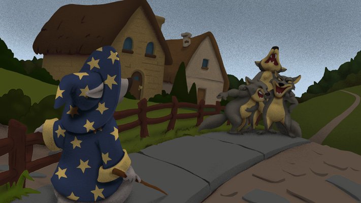
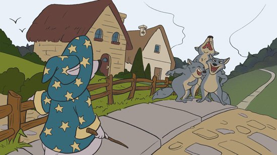
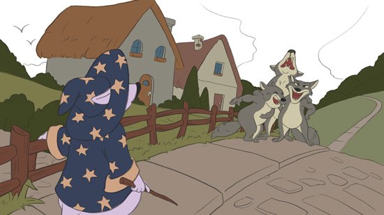
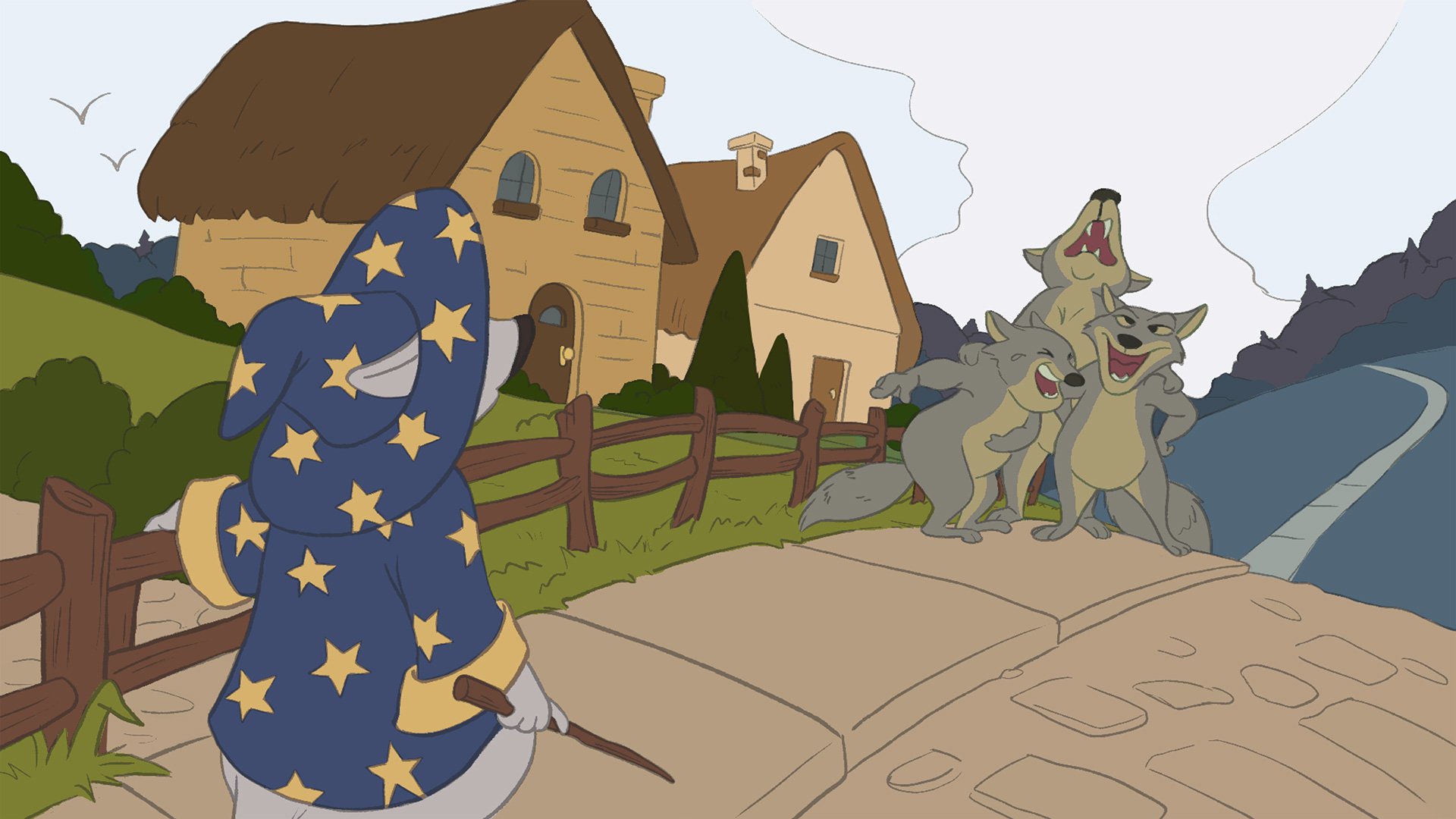
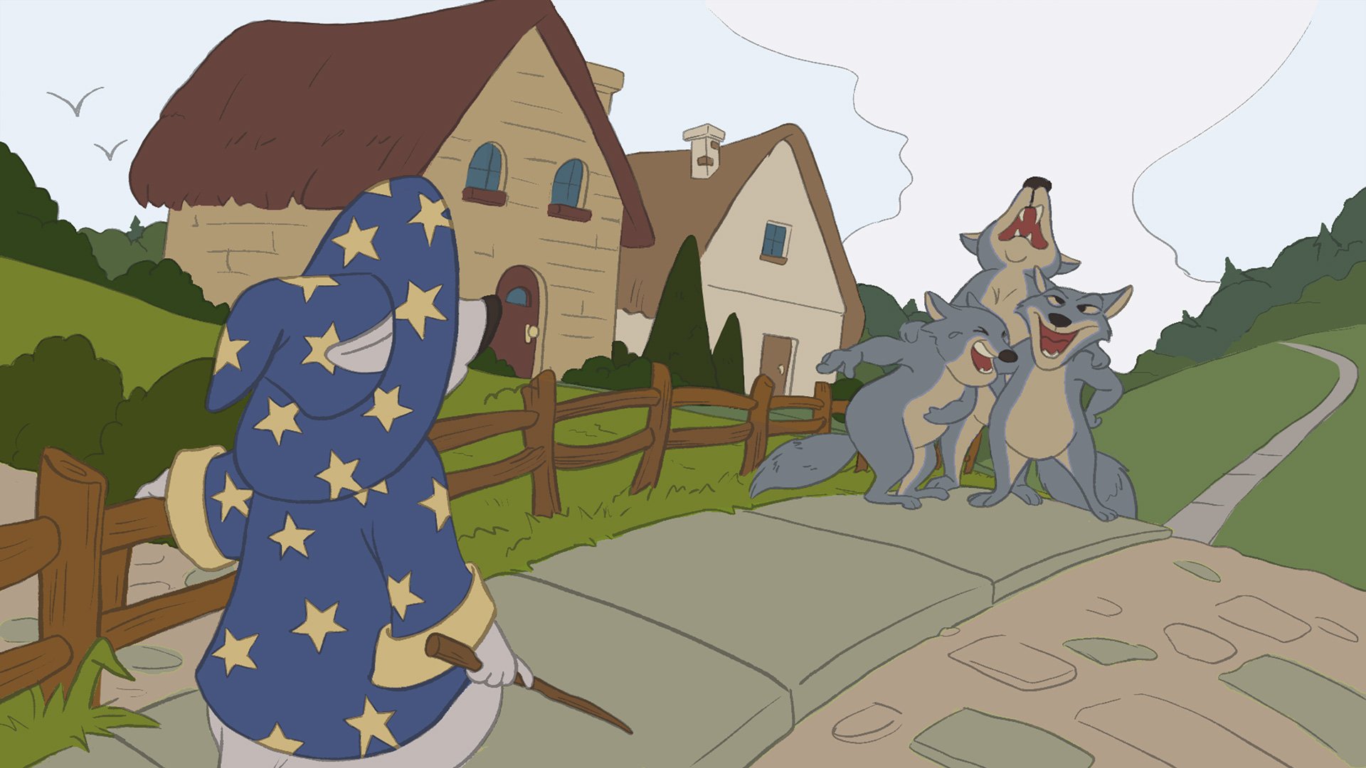
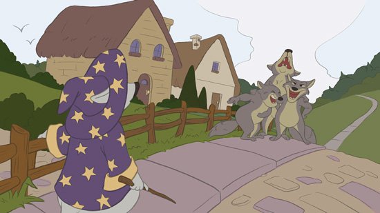
A young wizard’s studies are, yet again, interrupted by heckling outside his home.

After months of enduring this, he finally has had enough. Time to put his studies to use.

The wizard sends a murder of crows to "encourage" the offenders to leave. 😄

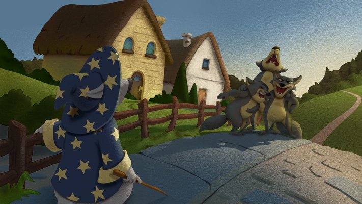
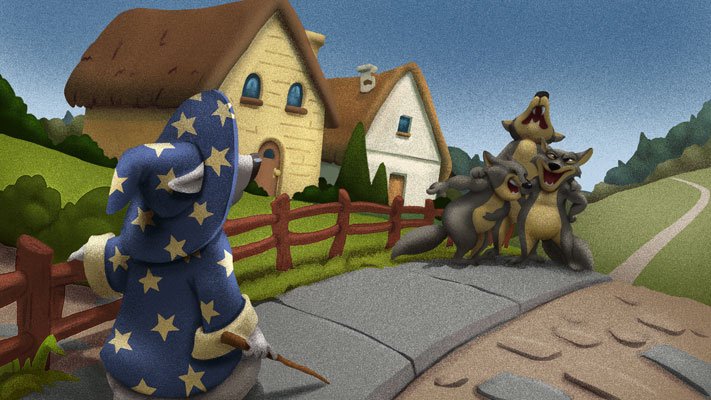
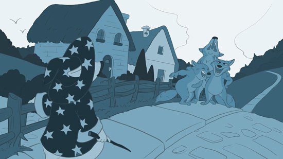
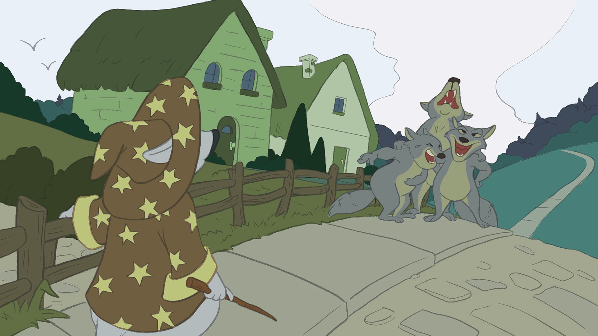
Some lighting comps to test which time of day worked best to match my story's intent. In this case, I chose a noon scene to enhance the uncomfortable feeling I wanted to convey. 

Wizard dog character turn-around.

While this wasn't necessary for the assignment, I created this turn-around for my main character just to practice.

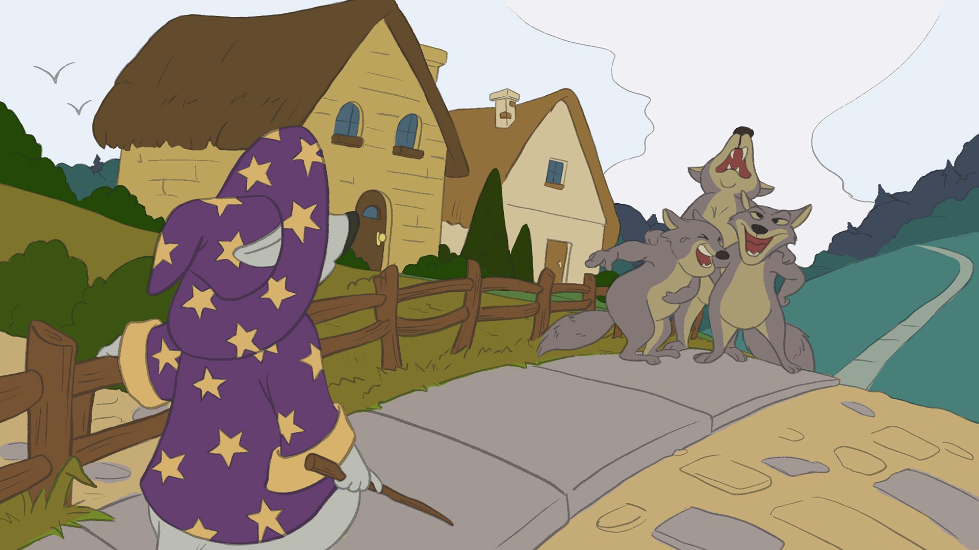
Different colour compositions using colour harmony for one of the images. I did this for each one.

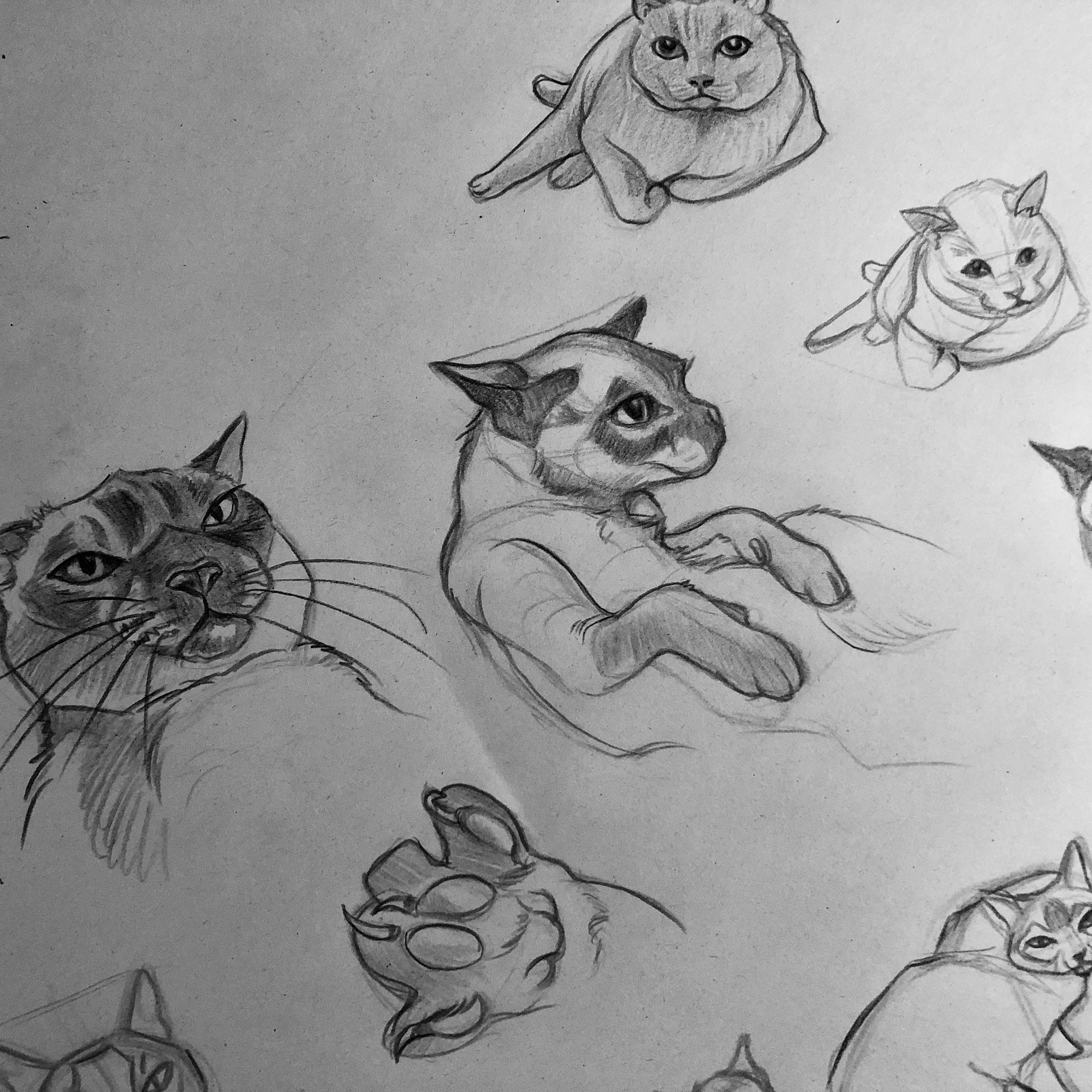
Some of my thumbnails. Thanks for reading!

Recent Studies, Recent Art

Sorry for the lack of blog updates these past months! I decided early this year to focus my efforts on learning and creating more artwork to add to my portfolio, stores and Instagram pages. I’ve also been helping out an animator with an informational video on a tight deadline. I’ll talk more about that in an upcoming post.

In order to produce more personal work, I began to set some time limits for myself for each piece and, as a result, I became much more efficient and produced more work in a few months than I did in an entire year. I realized a lot of what slowed me down in the past was overthinking things. Don’t get me wrong, I occasionally still do but I’ve been trying my best to push past it. I totally get that ubiquitous t-shirt phrase, Don’t Overthink It.

Letting go to draw whatever came to mind and trying out whatever style was also very freeing—I was coming up with ideas far more often. Too often, sometimes, but that’s a good thing, right? My main struggle these days is I have trouble trying to stick to a single subject matter and style because I love to explore. It would be nice to be recognized for my style. I’m not sure if I have one yet. Maybe one day.

Because I’m constantly trying to increase my knowledge of technique, I followed some tips I picked up from my Schoolism classes and I started to do more light studies, studies of animals, action poses and backgrounds. I began to notice improvement to my finished pieces which I’ll save for another post. I felt like I was able to produce them a little more easily than I had in the past. Although I was pleased at how some of them turned out I know there will always be room for growth. I did start to think: Wow, did I really do that? There was a time when I would make numerous studies and still feel like I wasn’t advancing. I was embarrassed to share them so often I didn’t. To me they weren’t good enough—I made the mistake of comparing myself to others. We are often hardest on ourselves, right? I’ve since changed my perspective and instead try to learn from those artists I admire. Below are some of the studies I’ve been doing this year.

Light Studies:


Exploration of Shapes, Expressions and Line of Action :

Landscape Studies From Photos and Paintings:

Animal Studies:

Thanks for looking!

Reviewing RedBubble with New Artwork

As an independent artist there are many venues that do print-on-demand so it's hard to vet them all. However, having heard good things about RedBubble from fellow artist friends, I decided to try them out. I'm happy to share that I've added them to the list of stores that sell my artwork. Recently, I added some new artwork featuring a re-designed version of a Chow Chow character. I created it a while back for a friend's comic pitch that unfortunately didn't make the cut for an anthology. I felt it was a shame to shelve the character so I decided to take another crack at "Gordon" to see if I could push his design further and make him more adorable. I'm all about the cute these days and feel like it's a direction I want to keep going in, at least for now.

I ordered some things from both my RedBubble and Society6 stores using the same design in order to compare the quality, colour accuracy and speed of delivery.

My First Impression of RedBubble:

RedBubble performed better than my other store, Society6, when it came to delivery time but for Canadians I think there may be a bias. RedBubble has a location in Burlington, Ontario and I'm in nearby Toronto. Society6 ships from the US so there will always be a delay at the border. I think customers in the US would get comparable delivery speeds because RedBubble also has a American location.

I was already impressed with getting my packages quickly—within 5 days—along with a follow-up email to confirm delivery but it didn't end there. All of items from RedBubble arrived together. The packaging was also really well-designed and my mug was even safely nestled in a sleeve within the outer package. I don't know how many times I've received things from other vendors where items arrived bent or broken so this was nice to see. You can tell they put a lot of thought and care into it. Their attention to details—a tiny wooden clothes peg holding the tee-shirt tag, overall product quality, colour consistency amongst the products, and printing accuracy—helped make a really good first impression. I'm quite happy I tried them out.

Society6

My Society6 items arrived separately (because they use different fulfillment vendors) and took much longer, likely due to clearing customs. While Society6 provides tracking while in transit in the US, they don't extend that after it reaches Canada so that's something I'd like to see improved. Most items took about 2 weeks to arrive but the notebook ended up taking over 3 weeks! I had just sent in a request for a replacement, fearing it had been lost, when it finally arrived. Doh! One thing I will say is that their return/refund system is quite smooth and painless. Their customer service response is pretty good; I waited less than 24 hours.

Because Society6 uses different vendors I believe that's why the colour wasn't consistent from product to product. For instance, although the travel mug (on the left, in the second image below) looked good it was a lot more yellow than I would have liked. The hubby and I were split on which stickers we preferred, the glossy Society6 stickers or the RedBubble matte treatment. Both were of very good quality. Time will tell as to which one is more durable. The notebook turned out nicely. The paper has a nice smooth texture similar to 28-lb bond paper. I can foresee filling it up with lots and lots of drawings!

The Re-design

And lastly, some of the sketches leading up to the revised design of Gordon.

2017 Year-in-Review

I'm not usually one to write these types of things. Every year has both its good and bad days, challenges and learning experiences but I considered 2017 to be a pretty good year for the hubby and I. I'll highlight some of the reasons below:

A Creative Collaboration:

At the end of last year, my husband and came up with a little creative endeavour for the both of us to work on (a small app). While I worked on fleshing out the characters at the beginning of 2017, we started to see a bigger potential for it and being the crazy creatives we are, imagined all kinds of things it could transition into. Based on the characters' expressions, we started to see their personalities emerge and my husband ended up coming up with the characters' names, backgrounds and motivations with the possibility of later creating a story with them in it. Although I have illustrated stories for others, neither of us had had much experience writing our own but we thought it would be a good opportunity to put some of the things we've learned over the past few years to use.

I had managed to get most of the characters cleaned up and in various poses when paying client gigs came in and we had to put it and other personal projects on hold. My husband is a web developer which tends to be all-encompassing and, when I get deadlines, I tend to brush everything else off to focus on that. Because work kept coming in, the project had to sit on the back-burner.

Client Work:

Client work came from a variety of industries which pushed me to learn new things quickly to be able to meet my deadlines. I had a lot of new experiences: I ended up pencilling and inking a comic cover to be coloured by another artist; I did my first-ever full-colour comic work, from pencils to colours and lettering; I designed a banner to promote a book I worked on, and a YouTube still for a musician I know; I collaborated with an art director from an ad agency on a few projects including spot illustrations, package label, and logo. It felt a little surreal getting all these requests because, due to lack of time, I had distanced myself from social media. I'm still not sure which was the cause and which was the effect!

One of the projects I collaborated on with an art director went through a number of iterations before a final image was chosen. It started off as a relatively simple cartoon likeness of the client but they ended up wanting to push it further into the realm of caricature. Unfortunately, I can't show the final image but you can see some of the iterations.  This process opened my eyes to the nuances of what art directors and clients might ask for.

Things I learned:

Even with client work, I made a point of trying to keep up with my online Schoolism classes, albeit at a slower pace. I learned a lot of useful tips that I plan to apply to the latter half of our project. While I didn't have much time to do the homework, I did watch and absorb a few online courses. I love how it gives me a new perspective about art and the many ways to approach it. Hearing other artists share their experiences, backgrounds and tips, has made me feel less stressed about my own art and more excited about the future and possibilities. This was a huge revelation for me because I've always been a little too critical about my work which sometimes tends to hold me back. I'm learning that everyone has their own creative process and style so I need to not be so hard on myself. 

I learned a great many things that contributed to my feeling much happier in 2017. I learned that it's not necessary to compare myself with others but to embrace the things I do well as an artist. That doesn't mean I will stop trying to push myself or evolving. I learned that limiting my exposure to social media made me less stressed and distracted. I learned not to worry too much about what others think and to instead focus on my work and projects; there will always be people that like what you do. I also learned a little about legal contracts and picked up copies of Graphic Artists Guild Handbook: Pricing and Ethical Guidelines and Business and Legal Forms for Illustrators.

Thanks for all the support and here's to a healthy and prosperous 2018 to you all! 

Candle Lanterns

I was flattered to be asked to draw a still image to accompany Jeff Gunn's lovely Candle Lanterns song on YouTube. I am a fan of his work and sometimes play his songs while working. It's really relaxing and helps me focus. 

Jeff has partnered with pledgemusic.com to release his full album, All the Roads We Takethis October. The song, Candle Lanterns, was written to commemorate the Bang Fai Festival on the Mekong River in Thailand. His album contains a collection of songs that were inspired from his travels around the globe over the last 10 years. All the sounds in the album were produced solely on the guitar using harp harmonics and was built on the versatility and beauty offered by the guitar. I encourage you to have a listen and, if you like it, please consider making a pledge to help him get his album out. Additionally, he is contributing 5% of all proceeds to Plan International. Thanks so much for taking a look!

Jeff Gunn is a Juno Award-nominated songwriter, contributor for Guitar World Magazine, Acoustic Guitar Magazine, National Geographic and author of the Hidden Sounds Guitar series. 

Below is the final image along with some of the draft versions leading up to it. I hope you enjoy!

Tub Sauce

I was recently commissioned to create a label to go on a mason jar as a birthday gift. The client wanted an illustration of his friend, Taras, who enjoys making his own tomato sauce with ingredients from his backyard. I was told that he washes the tomatoes in his clawfoot tub so the client came up with this fun idea of having him in the tub with his tomatoes sipping a glass of wine while he scrubs his back. I thought the idea was cute and really enjoyed working with the art director, Samantha, who was the go-between for this little project.

It started with me trying to get his likeness down from the photos I was sent. I was given a concept sketch to use for inspiration and asked to see if I could come up with other ideas. Because of the tomatoes and herbs, I thought it might be nice to add them as a decoration around the image and we did end up using that. The toothbrush was another fun thought that popped into my head but in the end we ended up using a bit of the initial concept with the herb and tomato border. My hubby came up with a couple of great text ideas but in the end they wanted to go with text that more closely matches his hand writing. The text, cutout and framing was all done by Samantha who did such a wonderful job. I'm told the recipient was quite surprised and pleased with his gift!

Character Designs for a Comic

I've been busy working on a few projects in development but this is something I can share. My friend, Robert Iveniuk asked me to help him pitch a short comic called The Ruins with animals as the main characters. He knows my soft spot. 

Below are my interpretations of his characters: Kirby, a Schnauzer; Penny, a Beagle; and Gordon, an adorable Chow Chow, along with a group of hungry raccoons they encounter. I understand that the story is to be in black and white but I couldn't help but want to see what they would look like in colour. 

Update: Although our pitch did not make the final cut, (there were a large volume of submissions to the publisher) this doesn't necessarily mean that we won't do something with this in the future. In the meanwhile, I have been busy with other projects and commissions. I hope to share some of them soon. 

Ballerina goldfish watercolour painting

I've been watching Terryl Whitlatch's videos on Creature Design, and week 2 was all about creating a fish-hybrid using either an amphibian or reptile as the other portion. In my search for reference of koi fish for the one part, I stumbled upon images of the pinkish-white ballerina goldfish. The fish's large but delicate fins make them visually appealing, somewhat like flower petals. So, my initial drawings of koi fish morphed into a ballerina-koi hybrid fish and the homework was temporarily abandoned so that I could pursue this image further.

I decided to paint it in watercolour using one of my favourite colour combinations of turquoise and orange. I set about creating rough sketches on paper, then brought it into Photoshop to play with the design before committing paint to paper. I used Dr. Ph. Martin's lightfast indian ink and white acrylic paint.

The original will be available for sale on my Etsy store. Regular prints and other items featuring this image are available at my Society6 and Zazzle stores.