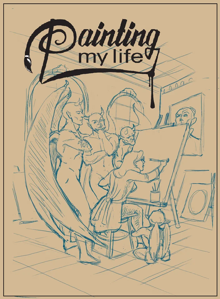
Painting My Life Preview Issue Comic Cover

I was flattered to be asked to draw and ink an alternate comic cover for Canadian writer and filmmaker, Pasquale Marco Veltri. He wanted the cover for the preview issue of his graphic novel, Painting My Lifepencilled and inked by Ian Wright and coloured by Jorge Cortes

The creative brief I received was to have the main character, Alice, seated in the centre of a room, painting herself and everything in the room on canvas while gargoyles watch attentively nearby. He wanted the painted scene to be repeated in the painting within the painting. To increase the level of unease, he wanted the painting of the old woman on the wall to be repeated on most of the canvases, watching Alice work with varying levels of disapproval or dismay. This was a challenging image to work on because of all the elements and expressions. Because I'm a huge fan of animation and anime I took inspiration from some of my favourite shows and movies when designing the characters while trying to maintain the main characteristics of the characters I drew.  A mirror was always at hand while I acted out some of these poses and expressions!

While drawing this out in Clip Studio, I ended up adding in some flats for my own purposes to help me separate the foreground from the background. I'm not a typical penciller laying out shading and heavy inks because I often colour the page myself and so I was a little worried whether my pencils had enough information for the colourist but my fears were unfounded as he did a fantastic job! When I saw the finished version, I was surprised that his colour scheme was actually similar to my working flats. When I did my flats, I thought it would be nice to colour it later but then another project came up and it didn't look like I would have the opportunity anytime soon. 

Watercolour Painting of Peonies and Dragonflies

Some months back I purchased a set of Dr. Ph. Martin's India Ink because I heard they were nice to work with. This past weekend I felt the urge to try them out.

For my first painting I didn't want to try anything too complicated. I just wanted to get used to working with the medium. I picked a spring theme because I'm tired of the cold weather that feels like it will never leave!  I chose peonies as my main subject because they remind me fondly of yearly trips my family and I used to make visiting my grandmother in New Brunswick. She had the most beautiful peony bushes growing in front of her house so when I see peonies they remind me of her and those carefree days. I also chose pretty dragonflies that remind me of spring. I painted my favourite colour combination of oranges, greens and blues. My second week's assignment for Nathan Fowkes's class on composition was to use unity with variety to create a meaningful relationships with the subject and I kept that in mind when creating this piece.

I used a couple of fine nibs, and a size 10, white Taklon brush on 140-lb cold-pressed paper (un-stretched). I found them all delightful to work with. I taped down my page and didn't use a lot water so the paper stayed fairly flat. I finished with three light applications of Krylon matte archival fixative spray.

The original will soon be available to purchase but I've put up prints and products featuring this art on my Society6 shop. For a limited time, there is a free shipping promotion going on. Promotion expires May 8, 2016 at Midnight Pacific Time.  

Promo code: https://society6.com/rinarozsas?promo=8QPG4QQM2C8G

Update: The original is now available on my Etsy Shop.

Schoolism - Pictorial Composition - Week 1, Engaging Your Audience

I often wonder if I've hit all the marks with a piece I've worked on so I decided to take Pictorial Composition with Nathan Fowkes because I know that it's an important aspect to making a successful image.

Nathan said, "Artwork is made up of rendering, colour and composition." He shared that we all have a tendency to focus on the first two but, without composition, an image can lack depth and fall flat. Colour is the frosting while composition is more of a fight. We need to learn what to emphasize or leave out. The course would cover what makes an image a compelling and engaging piece. 

This week's assignment began by putting together a reference file of images of any kind that inspire and move us: frame captions, photography, animation, or films that we felt had a pleasing composition. Of 3 images we were asked to paint copies but in a specific way. We were to deconstruct them to find out what made them tick. I chose one background painting from Studio Ghibli's Spirited Away (art by Kazuo Oga), one painting by Lord Frederick Leighton, and one painting by Frank Frazetta.

How we went about deconstructing them:

  1. Create a quick study of each that uses only 3 greyscale values to depict the original scene. No soft edges, no textures, just 3 values forcing you to think and make clear choices on what to edit and why. It reminded me of gesture drawing where you must quickly put down the essence of what's important. One should be able to tell at a glance what's going on in the picture.
  2. Make a full-range greyscale study of the same images, maintaining the strength and intent of the originals while minimizing extraneous detail. Again, no textures, just the guts. This was tough because I normally love to add detail; I had to constantly remind myself not to do that.
  3. Lastly, do another study, almost the same as the previous step, albeit in full colour. Each study was to be made in under an hour.

I'm not sure if I was completely successful but I feel like I already learned some valuable tips that I'll keep in mind for future projects.

Wraparound Cover for Seven Strange Stories

I was excited to be asked to create a one-page cover for Oliver Ho's upcoming comic anthology entitled, Seven Strange Stories, even though I had already illustrated a couple of the stories within. As we went back and forth with the designs, it evolved into a wraparound cover to allow for more elements from each story to be weaved in without feeling too congested. With most of the stories containing some supernatural theme my goal was to create an image that looked like a dark fairy tale but without being too extreme—just enough to suggest it. Because I am a huge fan of James Jean and his work often contains disparate components, I looked to his art for inspiration.

My Process on Getting Started

Despite looking at various Fables covers, I still didn't have a clear idea in mind. So, I jotted down some elements from each story that I wanted to draw and then started to sketch them out roughly onto a huge pad of newsprint. I tried not to worry about creating anything concrete but focus on loosening up and get a feel for what might be included on the cover. Sometimes just doodling whatever comes to mind or doing practice drawings will do the trick to keep from overthinking things. Oftentimes, I go into a bit of a trance and drawings begin to overlap because I don't want to turn the page. I'll often look back at my scribbles and an idea will come to me—not always for what I'm currently working on, mind you—but I can always use them for other projects. I liken it to staring at clouds or patterns where images would begin to form.

I sketched out some thumbnails from the ideas and sent the ones I liked best to Oliver. When he approved one I took it into Photoshop to further develop; I created a clean image using a pencil brush on a greyish-toned background that I would later paint over.

Colour Selection

Ah, colour selection. This one's always tough for me because, well, the paradox of choice, of course. :)

I decided that I want a limited palette because it's more efficient and creates a better balance. I went to paletton.com and selected a tetrad colour scheme of blues, greens and their complimentary oranges. I chose this combination to emphasize a slightly sinister theme with warmer tones to balance things out and suggest that things are not all doom and gloom. I also use white but not pure black and combine colours from my palette to create variations. When I was almost finished painting I tweaked some of the colours using a Levels Adjustment Layer.

Design Challenges

I had never created a wraparound cover before and there were a couple of things to consider including: 

  • Not having any important elements overlapping the spine. The spine width depends on the paper stock, the number of pages and binding style, so I worked this all out before painting.
  • I also had to consider the placement of the title, trade dress and promotional text while keeping an overall strong composition. I planned out roughly where all these items would go and made sure that they wouldn't obscure anything important in the art.

The book is still in production but it shouldn't be too much longer. When I have more information on its release, I will share details.

Update

The book is now available and can be purchased directly from Oliver Ho at  www.sevenstrangestories.com. You can also find the book at the Page & Panel: The TCAF Shop, Silver Snail, and Another Story Book Shop.


Heady Mental Cover - Second Issue

Back in April, Sam Noir approached me about contributing a painted cover to his anthology, Heady Mental. I had a good chuckle when he told me his idea for the cover. Because of other commitments at the time, I told him I was interested but couldn't immediately commit. Luckily, he wasn't in a rush and was willing to wait. Some other obstacles arose further delaying things...but at long last it's finished! I can't show the full image yet but below is a sneak peek. When the issue is published in a few weeks, I will post the cover here.

A trip down memory lane

About a month ago, a friend asked me to paint a portrait of his beloved childhood family dog—who has since passed on—to give as a birthday gift to his dad. There were a few challenges to overcome: a short time frame in which to complete and few useful reference photos to work from. In fact, some of the source material were screenshots taken from videotape. Despite that, I think I managed to capture the likeness, and my friend and his dad happily agree.

Sabrina commission complete

Well, this one took a little longer than expected, circumstances not withstanding but she's finally finished. The client is happy and I'm looking forward to my next project.

Sabrina - step 3 - paint

Before getting too involved in the details, I've laid in some flat colour with which to show the client. I've added the pillow colour and flooring on different layers so that I can make quick changes should the need arise.