Watercolour Painting of Peonies and Dragonflies

Some months back I purchased a set of Dr. Ph. Martin's India Ink because I heard they were nice to work with. This past weekend I felt the urge to try them out.

For my first painting I didn't want to try anything too complicated. I just wanted to get used to working with the medium. I picked a spring theme because I'm tired of the cold weather that feels like it will never leave!  I chose peonies as my main subject because they remind me fondly of yearly trips my family and I used to make visiting my grandmother in New Brunswick. She had the most beautiful peony bushes growing in front of her house so when I see peonies they remind me of her and those carefree days. I also chose pretty dragonflies that remind me of spring. I painted my favourite colour combination of oranges, greens and blues. My second week's assignment for Nathan Fowkes's class on composition was to use unity with variety to create a meaningful relationships with the subject and I kept that in mind when creating this piece.

I used a couple of fine nibs, and a size 10, white Taklon brush on 140-lb cold-pressed paper (un-stretched). I found them all delightful to work with. I taped down my page and didn't use a lot water so the paper stayed fairly flat. I finished with three light applications of Krylon matte archival fixative spray.

The original will soon be available to purchase but I've put up prints and products featuring this art on my Society6 shop. For a limited time, there is a free shipping promotion going on. Promotion expires May 8, 2016 at Midnight Pacific Time.  

Promo code: https://society6.com/rinarozsas?promo=8QPG4QQM2C8G

Update: The original is now available on my Etsy Shop.

My first attempt at acrylic painting after many years

About a month ago, and for the first time in years, I tried my hand at an acrylic painting on birch panel. I had to reacquaint myself with how fast acrylics dry, prepping the board, controlling my clumsy brushwork, and cleaning up—some of the reasons I had mostly abandoned traditional work for digital. While my first piece may have been a little too ambitious, there is something about the look and feel of traditional work that is difficult to reproduce digitally so I put the first piece aside to revisit at a later date.

This past weekend I painted a pet portrait on 8" x 10" canvas. It was for some friends, and of their beloved cat, Arthur. I think it turned out quite well. I suppose all that blundering around on the first piece helped with this latest one. I hope to do more of this because sometimes it's nice being able to hold a physical piece of art. 

Schoolism - Pictorial Composition - Week 1, Engaging Your Audience

I often wonder if I've hit all the marks with a piece I've worked on so I decided to take Pictorial Composition with Nathan Fowkes because I know that it's an important aspect to making a successful image.

Nathan said, "Artwork is made up of rendering, colour and composition." He shared that we all have a tendency to focus on the first two but, without composition, an image can lack depth and fall flat. Colour is the frosting while composition is more of a fight. We need to learn what to emphasize or leave out. The course would cover what makes an image a compelling and engaging piece. 

This week's assignment began by putting together a reference file of images of any kind that inspire and move us: frame captions, photography, animation, or films that we felt had a pleasing composition. Of 3 images we were asked to paint copies but in a specific way. We were to deconstruct them to find out what made them tick. I chose one background painting from Studio Ghibli's Spirited Away (art by Kazuo Oga), one painting by Lord Frederick Leighton, and one painting by Frank Frazetta.

How we went about deconstructing them:

  1. Create a quick study of each that uses only 3 greyscale values to depict the original scene. No soft edges, no textures, just 3 values forcing you to think and make clear choices on what to edit and why. It reminded me of gesture drawing where you must quickly put down the essence of what's important. One should be able to tell at a glance what's going on in the picture.
  2. Make a full-range greyscale study of the same images, maintaining the strength and intent of the originals while minimizing extraneous detail. Again, no textures, just the guts. This was tough because I normally love to add detail; I had to constantly remind myself not to do that.
  3. Lastly, do another study, almost the same as the previous step, albeit in full colour. Each study was to be made in under an hour.

I'm not sure if I was completely successful but I feel like I already learned some valuable tips that I'll keep in mind for future projects.

Wraparound Cover for Seven Strange Stories

I was excited to be asked to create a one-page cover for Oliver Ho's upcoming comic anthology entitled, Seven Strange Stories, even though I had already illustrated a couple of the stories within. As we went back and forth with the designs, it evolved into a wraparound cover to allow for more elements from each story to be weaved in without feeling too congested. With most of the stories containing some supernatural theme my goal was to create an image that looked like a dark fairy tale but without being too extreme—just enough to suggest it. Because I am a huge fan of James Jean and his work often contains disparate components, I looked to his art for inspiration.

My Process on Getting Started

Despite looking at various Fables covers, I still didn't have a clear idea in mind. So, I jotted down some elements from each story that I wanted to draw and then started to sketch them out roughly onto a huge pad of newsprint. I tried not to worry about creating anything concrete but focus on loosening up and get a feel for what might be included on the cover. Sometimes just doodling whatever comes to mind or doing practice drawings will do the trick to keep from overthinking things. Oftentimes, I go into a bit of a trance and drawings begin to overlap because I don't want to turn the page. I'll often look back at my scribbles and an idea will come to me—not always for what I'm currently working on, mind you—but I can always use them for other projects. I liken it to staring at clouds or patterns where images would begin to form.

I sketched out some thumbnails from the ideas and sent the ones I liked best to Oliver. When he approved one I took it into Photoshop to further develop; I created a clean image using a pencil brush on a greyish-toned background that I would later paint over.

Colour Selection

Ah, colour selection. This one's always tough for me because, well, the paradox of choice, of course. :)

I decided that I want a limited palette because it's more efficient and creates a better balance. I went to paletton.com and selected a tetrad colour scheme of blues, greens and their complimentary oranges. I chose this combination to emphasize a slightly sinister theme with warmer tones to balance things out and suggest that things are not all doom and gloom. I also use white but not pure black and combine colours from my palette to create variations. When I was almost finished painting I tweaked some of the colours using a Levels Adjustment Layer.

Design Challenges

I had never created a wraparound cover before and there were a couple of things to consider including: 

  • Not having any important elements overlapping the spine. The spine width depends on the paper stock, the number of pages and binding style, so I worked this all out before painting.
  • I also had to consider the placement of the title, trade dress and promotional text while keeping an overall strong composition. I planned out roughly where all these items would go and made sure that they wouldn't obscure anything important in the art.

The book is still in production but it shouldn't be too much longer. When I have more information on its release, I will share details.

Update

The book is now available and can be purchased directly from Oliver Ho at  www.sevenstrangestories.com. You can also find the book at the Page & Panel: The TCAF Shop, Silver Snail, and Another Story Book Shop.


Schoolism Gesture Drawing - Weeks 7 and 8

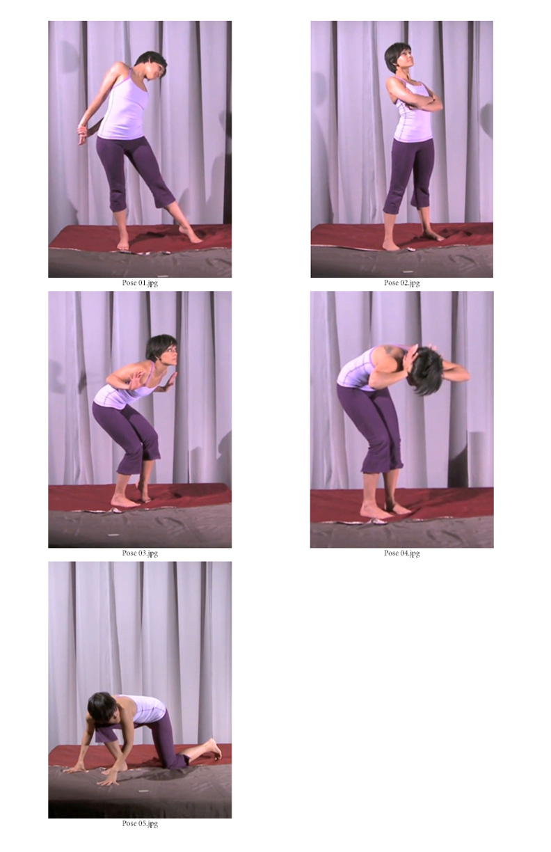
In Week 7 of Gesture Drawing with Alex Woo, we covered the final topic of the course which was story. The goal was to take everything we've learned thus far (the visual punctuation and grammar) and create a narrative from a sequence of the model's poses. It was okay to change a pose if necessary to help sell the story. I found this to be one of the toughest assignments of the course and, for the first set, ended up having to change parts of the remaining poses to suit the narrative I saw from the first pose.

In the second set, I drew in blue pencil and stayed within the 4-minute timeline but, to do so, had to keep most of the poses as they were. Because some of the poses did not feel natural to me and the arrangement felt bizarre so I found it very difficult to come up with anything other than golfing and the narrative felt weak as a result. 

Week 8 was a review and wrap-up. Our teacher also recounted some of his background and his journey as an artist. It was interesting to hear his story and to find some similarities in the art that inspired us, growing up. I've learned much from this course and glad I took it. It has certainly helped me get a little faster at drawing poses and coming up with narratives.

I am looking forward to my next course on Pictorial Composition with Nathan Fowkes, a veteran in the entertainment industry who has worked on a lot of my favourite Dreamworks films.

Schoolism - Gesture Drawing Week 6

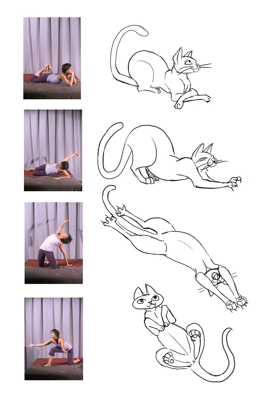
Now that the My Beloved Monster comic is out of the way, I thought I'd get back to where I left off in my Gesture Drawing class. Week 6 was about Extrapolation. In gesture drawing, it is the process of seeing beyond the surface of what's in front of you and drawing out the idea behind the pose onto another physiology. Week 5's homework of studying the anatomy of an animal of our choosing got us ready for this.

For our first assignment, we were to select 10 of our favourite examples of extrapolation from either animated or live action films where the animals show emotions and mannerisms we can relate to. We had to be careful not to select poses where they were overly anthropomorphized. I chose some of my favourite animal characters from Disney and one from Sony Pictures. It kind of makes me want to watch these movies all over again. These characters are so memorable and enjoyable to watch. 

The second part of the homework assignment was to take the idea behind the model's pose and draw it using our chosen animal instead. 

Some of these poses were more challenging than others and took longer than I thought. After using some of these principles on my recent comic book with a cat character, it made me see the value in this exercise coming up with body language for the cat on my own.


My Beloved Monster

As promised, below are a couple of teaser pages and a panel from a later page of Oliver Ho's comic, My Beloved Monster, minus the text. Oliver tells me that this story will be included in his anthology of monster stories he plans to publish soon.

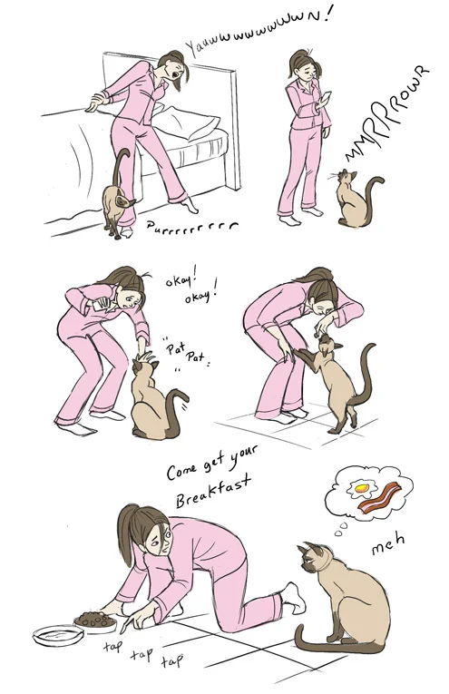
This was a fun story to work on. It's about a man who can't seem to catch a break in his love life and a cat that reluctantly decides to play Cupid. I really enjoyed bringing out the characters' personalities on the page.


Happy The Force Awakens Day!

I was overcome with inspiration to create something Star Wars related after listening to the soundtrack for the Force Awakens last night. I hope you enjoy! :)