Gothic Tales of Haunted Love

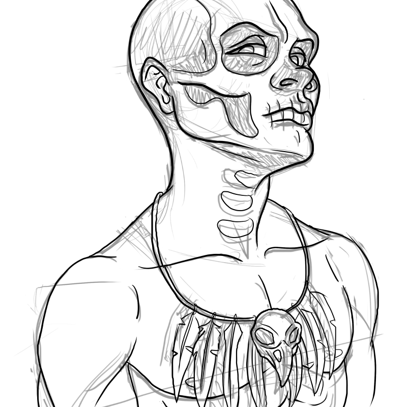
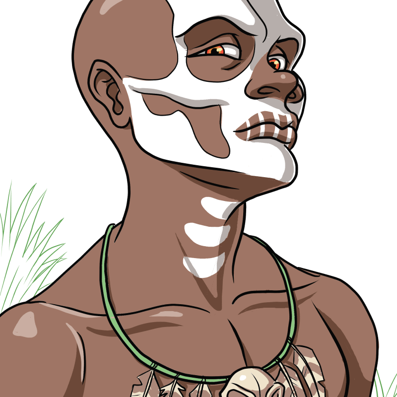
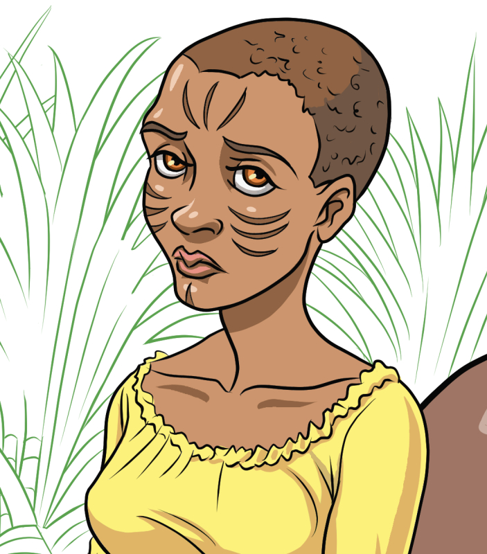
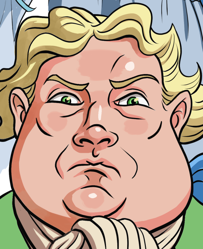
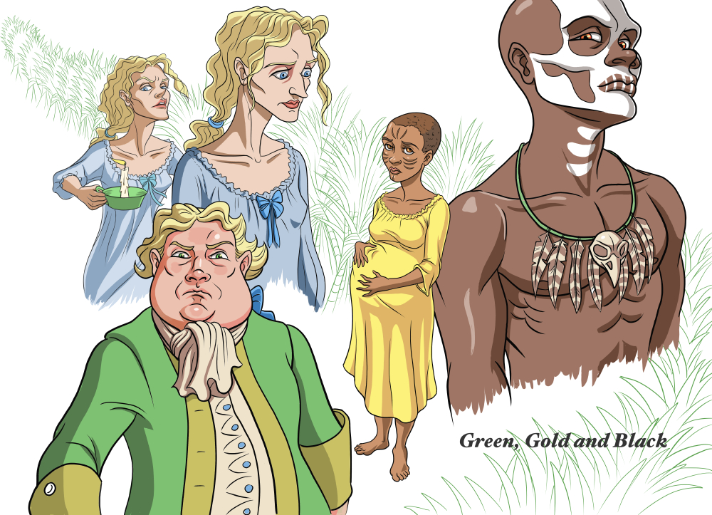
I'm super excited to be collaborating with my good friend, Cherelle Higgins, on a story she's written entitled: Green, Gold and Black. A story set in 1728 Jamaica, on the eve of a slave uprising. A young house slave tries to protect her newborn infant from a pair of vengeful ghosts.

Her story will be part of Bedside Press' Gothic Tales of Haunted Love comic anthology. There is a Kickstarter for it now so if you're into the spooky and romantic, please check it out!

Over the years, I've been fortunate to have read a lot of Cherelle's lush and imaginative stories, from cruel gods and goddesses to demons and angels, undead and other creatures I would never have imagined. She always manages to take a conventional theme and make it her own so I'm very happy she'll be getting another of her stories out there for others to read. If you haven't already, another story she wrote appears in the The Secret Lives of Geek Girls called Cherry where she tackles a past trauma. 

And now, some character concepts: 
Tub Sauce

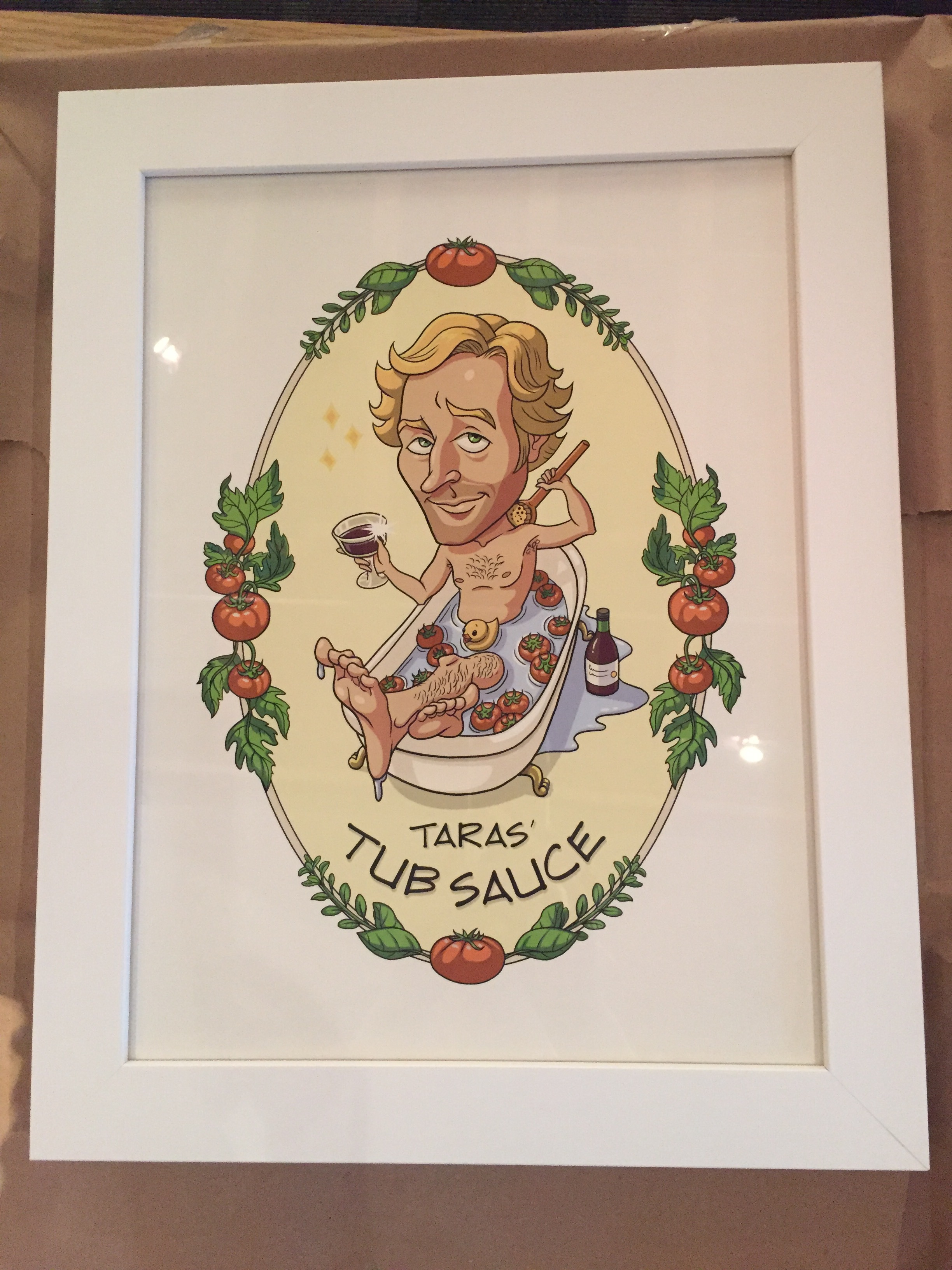
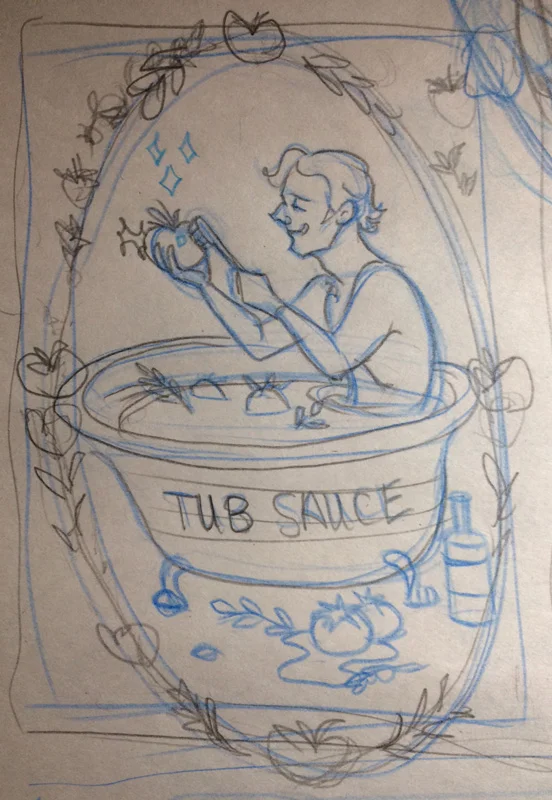
I was recently commissioned to create a label to go on a mason jar as a birthday gift. The client wanted an illustration of his friend, Taras, who enjoys making his own tomato sauce with ingredients from his backyard. I was told that he washes the tomatoes in his clawfoot tub so the client came up with this fun idea of having him in the tub with his tomatoes sipping a glass of wine while he scrubs his back. I thought the idea was cute and really enjoyed working with the art director, Samantha, who was the go-between for this little project.

It started with me trying to get his likeness down from the photos I was sent. I was given a concept sketch to use for inspiration and asked to see if I could come up with other ideas. Because of the tomatoes and herbs, I thought it might be nice to add them as a decoration around the image and we did end up using that. The toothbrush was another fun thought that popped into my head but in the end we ended up using a bit of the initial concept with the herb and tomato border. My hubby came up with a couple of great text ideas but in the end they wanted to go with text that more closely matches his hand writing. The text, cutout and framing was all done by Samantha who did such a wonderful job. I'm told the recipient was quite surprised and pleased with his gift!

Character Designs for a Comic

I've been busy working on a few projects in development but this is something I can share. My friend, Robert Iveniuk asked me to help him pitch a short comic called The Ruins with animals as the main characters. He knows my soft spot. 

Below are my interpretations of his characters: Kirby, a Schnauzer; Penny, a Beagle; and Gordon, an adorable Chow Chow, along with a group of hungry raccoons they encounter. I understand that the story is to be in black and white but I couldn't help but want to see what they would look like in colour. 

Update: Although our pitch did not make the final cut, (there were a large volume of submissions to the publisher) this doesn't necessarily mean that we won't do something with this in the future. In the meanwhile, I have been busy with other projects and commissions. I hope to share some of them soon. 

Romance Is in the Air

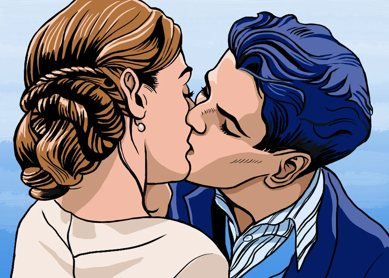
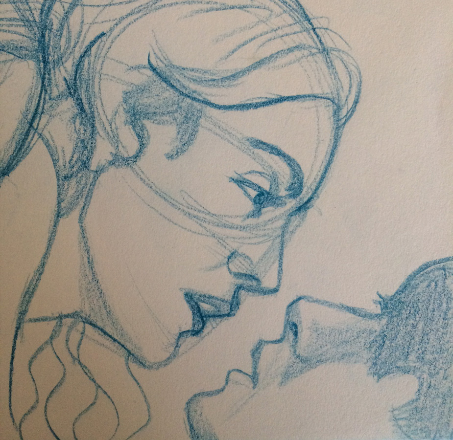
I was recently asked if I would be interested in working on something with a romance theme so I thought I would get in some practice by drawing screenshots of romantic TV shows I've watched. These particular shots were referenced from The Grand Hotel. It's a great show that had me hooked from the moment I started watching it. There's romance, comedy, and suspense, and the main actors have such great chemistry that I wanted to try my hand at capturing some of the intimate scenes. Drawing snapshots of scenes is a great way to learn composition, lighting, and story. 

I sketched a number of scenes using blue pencils. After posting up my drawings, it was suggested that I add some mood lighting so I brought them into Photoshop for inking and colouring. I decided to do a completely different take than what I saw in the first scene by using colours to suggest passion. I thought purples and pinks might be one way to go. One wouldn't think this would work but I think it did.

For the second image, I tried to interpret the existing lighting and colours into comic flats such as swapping out black hair with blue, etc. This was definitely a useful exercise. The more I draw something the more I hope to commit it to memory.

Sisters from Another Mister

In my last post I mentioned that I had been watching Terryl Whitlatch's tutorials on Creature Design where she explains the anatomy of various animals and why their anatomy is the way it is. She encouraged us to ask ourselves the why of the creature before beginning a design. 

One of the assignments was to create a fish hybrid using either an amphibian or reptile, and, in my search for reference for the assignment, I had stumbled upon a ballerina fish that became an inspiration for me. While I was exploring ideas for the first piece from my previous post, another idea popped into my head of a girl with hair made to look like those big flowing fins and so I scribbled it out as best I could. I wasn't sure at first where it would go but the backstory in my mind started to develop. The why of the hair would be camouflage to help her hide amongst coral and seaweed near her home. She became my version of a mermaid. She is pleasantly surprised to find a couple of friendly creatures with some similarities to her, hence the title. As you can probably guess, I'm not very good at coming up with titles.  ;) But I keep trying!

This is now available as a print and other items at my Society6 and Zazzle stores.

On a related note, I should point out who Terryl Whitlatch is. I also mentioned her in my previous post and it had completely slipped my mind that some readers might not know who she is. She is an amazing artist with a background in zoology. She might be best known for her work with LucasFilm, designing many aliens and species for Star Wars Episode 1 and some of the creature re-designs in the re-mastered trilogy. Here are some additional sites featuring her work. Go check them out!

Ballerina goldfish watercolour painting

I've been watching Terryl Whitlatch's videos on Creature Design, and week 2 was all about creating a fish-hybrid using either an amphibian or reptile as the other portion. In my search for reference of koi fish for the one part, I stumbled upon images of the pinkish-white ballerina goldfish. The fish's large but delicate fins make them visually appealing, somewhat like flower petals. So, my initial drawings of koi fish morphed into a ballerina-koi hybrid fish and the homework was temporarily abandoned so that I could pursue this image further.

I decided to paint it in watercolour using one of my favourite colour combinations of turquoise and orange. I set about creating rough sketches on paper, then brought it into Photoshop to play with the design before committing paint to paper. I used Dr. Ph. Martin's lightfast indian ink and white acrylic paint.

The original will be available for sale on my Etsy store. Regular prints and other items featuring this image are available at my Society6 and Zazzle stores. 


Valkyrie in Training

It's amazing how one doodle can be a catalyst for other ideas. This idea was based on my original Thumbelina doodle. For some reason, I kept going back to it and wanted to further explore other possibilities. At one point, she was riding a sea creature and, now that I'm taking Terryl Whitlatch's course on Creature Design, who knows what I'll come up with. :) 

In the end, I thought having the girl gleefully riding a pegasus while he tries his best not to drop her might be a more fun and comical piece; hopefully, my intent comes across. 

Thumbelina

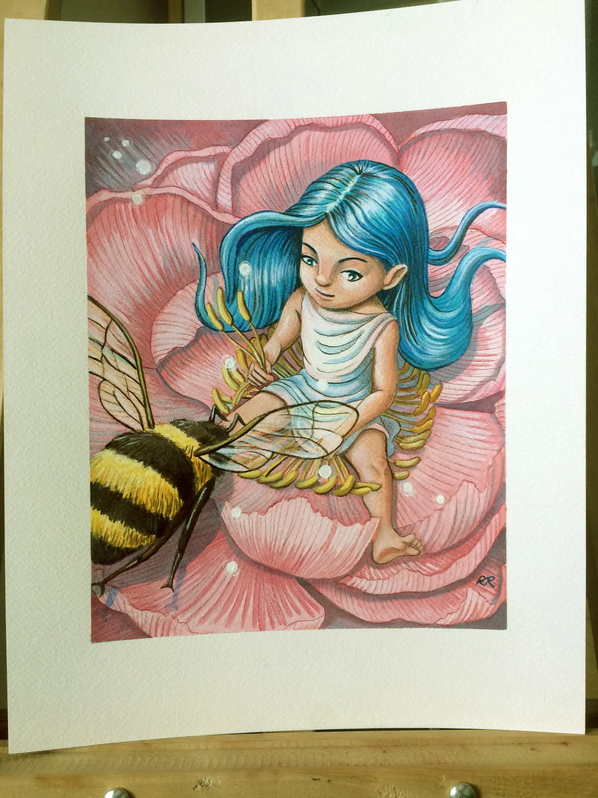
In my continuing quest to get back to traditional media, I decided to do this piece in watercolours with a touch of acrylics and Prismacolour pencil crayons to refine some areas. The idea was born while brainstorming a comic book cover but something about the girl stuck with me and so I put it away until I had more time to work on it. I ended up scanning it and bringing it into Photoshop to play with various concepts before printing it out and transferring it to watercolour paper. Instead of Fabriano paper, I used Arches 140-lb cold-pressed paper which has a slightly different texture than the Fabriano but still lovely to work on. I finished up with a couple of coats of Krylon archival matte fixative. 

I am continuing to try and apply what I've learned from Nathan Fowkes class on Composition to each piece. For now, I will be going into less detail about my classwork to focus more on producing art and blogging about it. I hope you keep reading because I still plan to keep sharing!

The original piece is now available on my Etsy Store and prints are available at my Society6 store.